June 28, 2026

The room is empty, the signage is coming down, and your inbox is filling up with the same question from different people: did the event work?
That's the moment post event analytics stops being an admin task and becomes a leadership task. You're no longer managing an event. You're defending budget, proving member value, and deciding what gets repeated, fixed, or cut.
For community managers, that pressure compounds fast. According to 2024 event industry data from Cvent, professional organizations host an average of 29 events per year, and 72% of marketers identify events as their most effective marketing channel. If your organization runs anything close to that pace, you don't have a data shortage. You have an interpretation problem.
Attendance alone won't solve it. A packed room can still produce weak sponsor outcomes, poor session fit, low member follow-up, or no meaningful retention lift. A smaller event can outperform expectations if the right people engaged extensively and took action afterward.
That's why the best teams treat the days after an event as part of the event itself. They gather feedback while it's fresh, review registration behavior, check session performance, compare member segments, and look closely at what happened after the closing remarks. If you invested in content capture or reliable event video production solutions, that post-event media becomes another layer of evidence. You can see which sessions keep delivering value after the live experience ends.
One more thing matters here. Events don't end at departure time for members. The strongest programs carry momentum into renewals, referrals, volunteer activity, and future attendance. If you need a practical bridge between the event and the relationship that follows, this guide to post-event engagement strategies is a useful companion.
Frequently, teams start in the wrong place. They open the registration report, pull the attendance count, maybe skim survey comments, and call it analysis.
That isn't analysis. That's inventory.
A real post event review starts with the questions your stakeholders will ask in plain language. Did members get enough value to come back? Did sponsors get enough visibility to renew? Did the program attract the right audience? Did staff effort produce something worth funding again?
The common mistake is confusing activity with outcome. You can have lots of booth scans, app opens, session check-ins, and social chatter without learning whether the event advanced your organization's goals.
That's why raw totals usually fail in budget meetings. Executives rarely need more rows. They need interpretation.
A good post-event report doesn't just say what happened. It explains why it mattered and what should happen next.
Right after an event, you have a short window where the evidence is strongest. Staff still remember operational issues. Speakers still recall audience response. Members can still explain what felt useful, confusing, or forgettable.
Use that window to build a narrative around three things:
That's the practical shift. Post event analytics isn't about proving the event happened. It's about proving the event mattered.
Post event analytics is often described too narrowly, as if it's just a report you run after the fact. In practice, it works more like film review after a competitive match. The final score matters, but it never tells the whole story.
According to Secutix's definition of post-event analysis, post-event analytics is the evaluation carried out after an event to measure success against predefined objectives, covering participant satisfaction, ROI, and content relevance. The same source notes a 2026 focus on integrating quantitative data with qualitative feedback so teams can explain the “why” behind the numbers.
The first layer is the obvious one. Registrations, attendance, no-shows, survey completion, session popularity.
The second layer is where the work gets more useful. Which member segments stayed engaged longest? Which sessions attracted registrations but lost people early? Which sponsors had visible activity but weak follow-up quality? Which first-time attendees behaved differently from long-time members?
The third layer is the one most organizations miss. What happened later?
For associations and membership-based groups, that's the ultimate test. Did the people who were most involved renew, volunteer, return for another event, join a committee, upgrade their membership, or bring in a colleague? If you're not asking that, you're still measuring the event in isolation.
Quantitative data gives shape to the story. It helps you spot patterns, exceptions, and weak points in the attendee journey.
Useful examples include:
That kind of analysis becomes much stronger when teams stop treating each event as a standalone moment. Longitudinal analysis matters because trends reveal whether your programming is improving, plateauing, or drifting.
Survey comments, staff debriefs, interviews, and sponsor conversations prevent bad conclusions. A lightly attended session might have had poor timing, not weak content. A crowded networking hour might have felt chaotic and unproductive. A sponsor may report high volume but low-fit leads.
That's why analytics needs both forms of evidence. If you only look at counts, you risk making confident but wrong decisions.
For teams building a more complete reporting habit, this article on analytics and insights for community organizations is a useful reference point.
Practical rule: If a metric can't lead to a decision, it belongs in the appendix, not the headline.
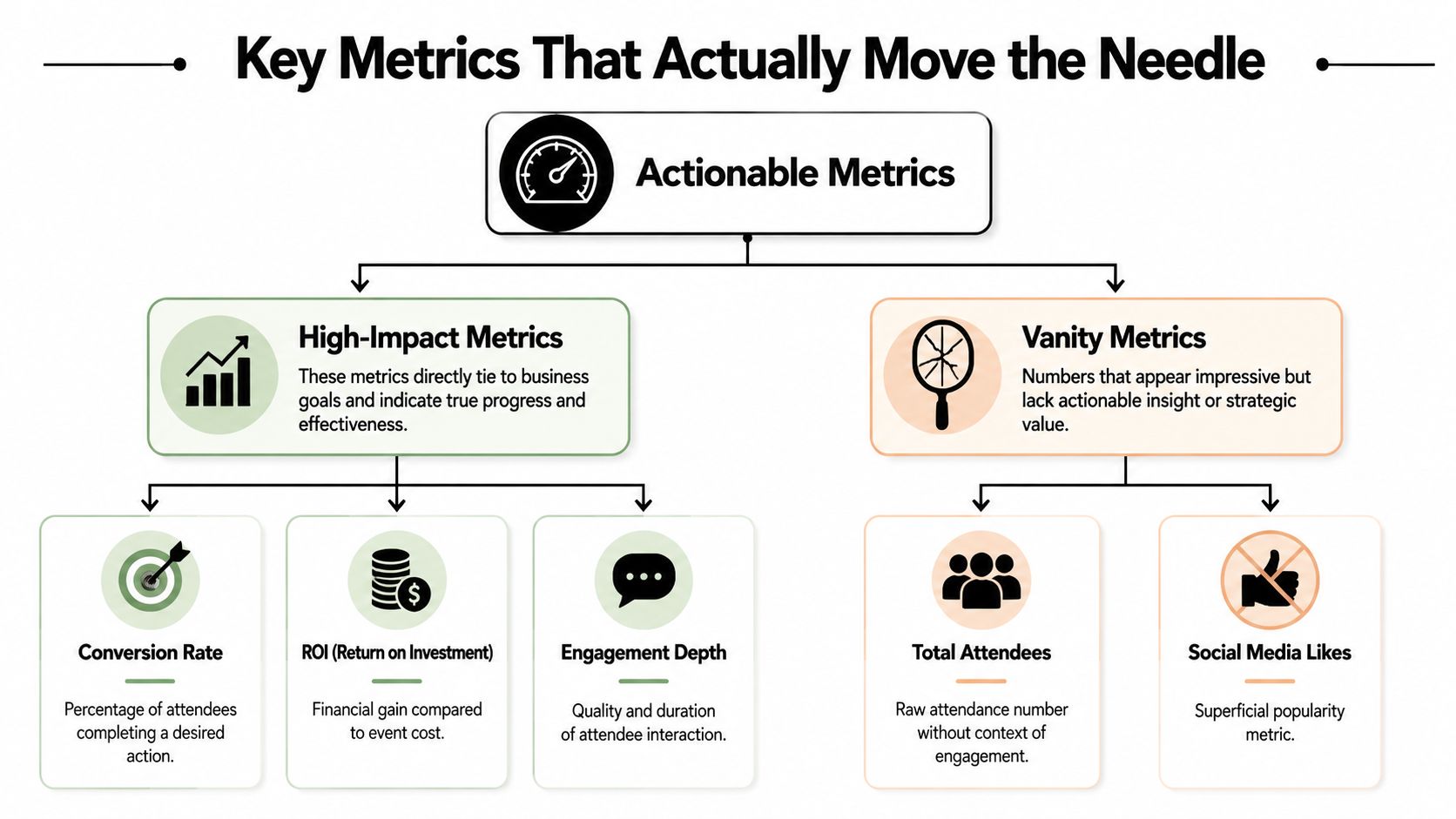
Most event reports are too crowded and too shallow at the same time. They include everything the software can export and almost nothing that helps a team decide what to do next.
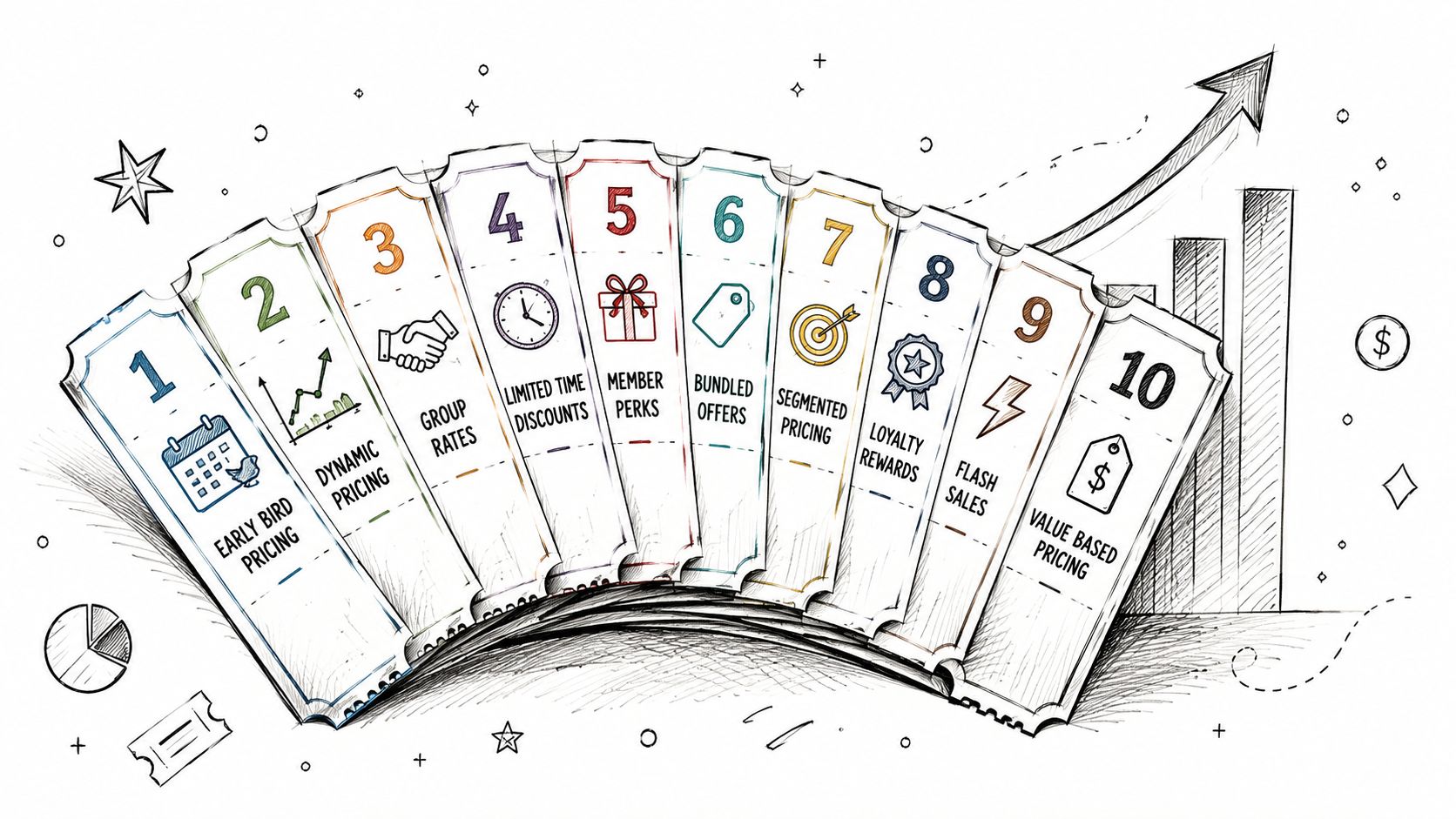
The fix is simple. Separate actionable metrics from vanity metrics.
According to Snapsight's guide to AI-powered event analytics, expert-level post event analytics starts during planning. Teams need consistent naming conventions for sessions and speakers, defined metrics for each touchpoint, and automated systems that pull and clean data from multiple sources. That matters because executives, marketing teams, and operations staff don't need the same answers.
A vanity metric sounds good in a recap. It doesn't help much in a planning meeting.
Examples of weak standalone metrics include total registrations, social reactions, and aggregate page views without context. Those figures can support a story, but they can't be the story.
Actionable metrics usually do one of three things:
This is the same reason optimization teams remind marketers to don't just track conversion rate. Secondary signals often explain whether a headline number is healthy, misleading, or fragile.
| Metric | What It Measures | Why It's Important |
|---|---|---|
| Registration conversion rate | The share of interested prospects who completed registration | Shows whether your event proposition and sign-up flow were strong enough to turn interest into commitment |
| Attendance rate | The relationship between registrations and actual attendance | Helps you judge reminder effectiveness, audience intent, and schedule fit |
| Session engagement | Participation depth within content sessions | Indicates which topics, formats, and speakers created real interest |
| Attendee journey flow | How people moved through registration, sessions, networking, sponsor areas, and follow-up actions | Reveals drop-off points and friction in the event experience |
| Lead quality | The relevance and fit of contacts generated for sponsors or membership teams | Prevents teams from overvaluing volume that doesn't convert into useful follow-up |
| Sponsor interaction depth | Meaningful booth visits, conversations, scans, or content interactions | Gives sponsors a stronger picture than exposure alone |
| Content relevance | Attendee feedback on whether sessions matched expectations and needs | Helps shape future programming decisions |
| Post-event follow-up response | Whether attendees opened emails, watched recordings, answered surveys, or took next steps | Shows whether the event created momentum after the live experience |
| Member segment behavior | Differences across member types, tenure, role, or engagement level | Helps teams tailor programming and retention strategy |
| Renewal or upsell signal | Whether event engagement appears linked to later membership actions | Connects event activity to long-term community value |
A practical dashboard usually needs separate views for separate stakeholders.
If you're trying to sharpen that business case, this resource on measuring event ROI in a more useful way can help frame the right metrics.
Don't ask which metrics matter most in general. Ask which metrics would change your next decision.
A workable analysis process needs discipline more than sophistication. The teams that get useful insight aren't always the ones with the flashiest dashboards. They're the ones that collect, clean, interpret, and share data before the organization moves on.
Start with the framework below, then adapt it to your event size and data maturity.
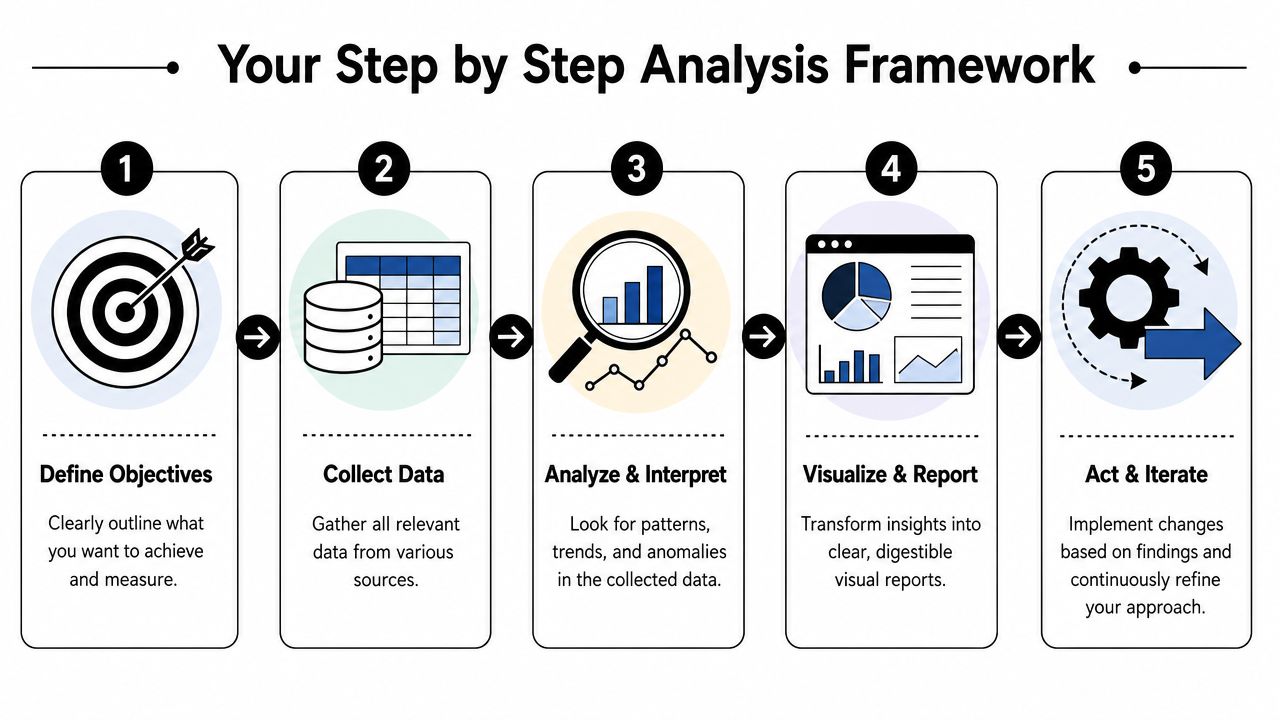
1. Consolidate your data sources
Pull together registration data, check-in data, session attendance, app activity, survey responses, sponsor interactions, and any CRM notes tied to follow-up.
This stage often exposes a key problem. The data exists, but it lives in too many places. A spreadsheet export from one tool rarely lines up cleanly with naming conventions from another.
2. Clean and segment the audience
Before you analyze anything, standardize labels and create useful segments. Separate first-time attendees from returning members. Tag exhibitors, speakers, VIPs, and sponsors. Distinguish highly engaged members from people who attended one session and disappeared.
If you skip this step, your averages will hide your most important patterns.
A strong review of the process can help teams align before they start interpreting results.
3. Analyze engagement patterns
Now look for behavior, not just totals. Which sessions drove sustained participation? Which networking formats produced follow-up action? Where did attendees lose momentum? Did one member segment behave differently than another?
Post event analytics, at this point, becomes strategy. You're looking for repeatable strengths and fixable weak points.
Teams usually find their most useful insight in the gaps between stages, not in the totals at the top of the report.
4. Visualize the findings
Turn the analysis into charts and summaries people can understand quickly. Stakeholders shouldn't have to decode your export file to see what matters.
Use trend lines, segmented comparisons, and exception highlights. If a metric is outside the expected range, make it visible immediately.
5. Write recommendations with owners
Every insight should lead to a decision, and every decision needs an owner. “Improve networking” is vague. “Change the format of the member mixer, assign two facilitators, and add guided introductions” is usable.
According to GEVME's benchmark guidance for post-event analytics, teams should collect immediate feedback right after the event, complete detailed analysis within the first week, and deliver a thorough report within two weeks. That timeline is practical because memory fades quickly and organizational momentum disappears even faster.
A few habits make that deadline realistic:
A dashboard fails when it behaves like a storage unit. It succeeds when it behaves like an argument.
People reading your report want to know three things fast. What happened. Why it happened. What should happen next.
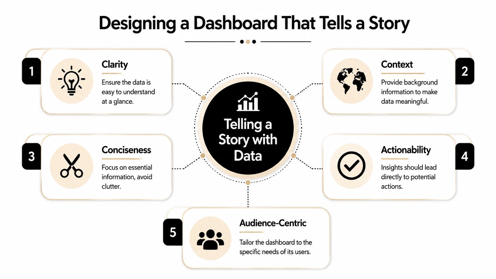
The first panel on a good dashboard should answer the top business question. If leadership is focused on renewal risk, lead with member participation patterns and post-event follow-up behavior. If sponsor retention is the urgent issue, lead with sponsor interaction quality and engagement pathways.
Don't force every audience to read the same way.
A practical dashboard usually works best in layers:
A number without context invites bad decisions. If registration conversion dipped, was the audience colder, the message weaker, or the form more complex? If one session underperformed, was it poorly promoted, badly timed, or misaligned with the audience?
That's why annotations matter. Add short notes directly to charts. Mark unusual conditions. Explain changes in format, schedule, or audience composition when they affect interpretation.
Field note: If someone can screenshot one chart from your dashboard and misread it completely, the dashboard needs more context.
It is a common practice for insights to be buried in dense reports. Ensure yours are not.
Use visual cues to surface:
The best report design is restrained. Fewer charts, better labels, and sharper takeaways usually beat a dashboard packed with everything the platform can export.
Post event analytics earns its keep. The point isn't to admire the data. The point is to change what your organization does next.

A sponsor rarely wants your full event report. They want their report.
That report should focus on the interactions tied to their package. Booth traffic quality. Content engagement around sponsored sessions. Meetings or scans that produced follow-up. Placement performance compared with less visible inventory.
The trade-off is straightforward. If you only provide visibility metrics, you'll have an easier report to build but a weaker renewal argument. If you provide behavior-based evidence, the report takes more preparation but gives the sponsor a clearer case for returning.
This is the missed opportunity in many membership organizations.
According to a 2025 Event Marketing Institute finding cited in LinkedIn coverage of post-event analysis, 78% of organizations track engagement during events, but only 12% link it to post-event customer lifecycle outcomes. That gap matters more for associations and subscription-based communities than it does for one-off commercial events.
Look at behaviors like session participation, networking activity, poll engagement, content downloads, and follow-up responses. Then compare those patterns against later signals such as renewal conversations, committee interest, return attendance, or upsell readiness.
You don't need perfect attribution to make this useful. You need enough behavioral consistency to identify groups like these:
That's where event strategy becomes membership strategy.
One event can tell you more about next year's content than months of internal debate.
A practical review often reveals:
The trade-off here is resisting anecdotal bias. Loud feedback after an event can distort planning. Analytics helps you separate the memorable complaint from the recurring pattern.
A final report is only useful if it changes the next brief, the next budget request, and the next member experience.
That's why post event analytics should run as a cycle. You set objectives before the event. You collect the right signals during it. You interpret outcomes quickly afterward. Then you turn findings into program changes, sponsor offers, member follow-up plans, and retention experiments.
The strongest teams don't ask whether an event was good in the abstract. They ask whether it advanced the relationship between the organization and the people it serves.
If you work in a membership-led environment, that standard matters. A successful event isn't just one that fills seats. It's one that strengthens belonging, creates reasons to return, and gives leadership a defensible case for continued investment.
Post event analytics does that when it connects behavior to outcomes and outcomes to decisions.
If you want a simpler way to manage events, memberships, engagement data, and reporting in one place, take a look at GroupOS. It's built for organizations that need to connect event performance with long-term community growth, not just produce another spreadsheet after the doors close.