June 14, 2026

After the event closes, the actual mess often starts.
An attendee filled out a registration form, scanned into two sponsor booths, downloaded a session handout, and asked about membership at the help desk. By the next week, that information lives in five places. One sponsor has a spreadsheet. Another has badge-scan notes. Staff has a CSV export from registration. Marketing has a newsletter signup list. Nobody is fully sure which contacts opted in, which ones are hot, and which ones already belong in the member database.
That's how associations lose leads they already paid to attract.
For associations and event teams, disconnected lead capture isn't just an admin problem. It affects member experience, sponsor renewals, and revenue planning. When lead data comes in through scattered tools, staff spends time cleaning records instead of acting on intent.
That matters because forms still sit at the center of lead generation. SalesGenie cites research showing that 84% of marketers use form submissions to generate leads, and the same source set reports that organizations generate 1,877 leads per month on average. For an association, that means every registration form, sponsor inquiry form, content download form, and membership interest form is part of a much larger operating system.
The failure rarely happens because nobody collected the contact. It happens because nobody connected the contact.
The fix starts earlier than many assume. It starts with the form itself and with how that form feeds your first-party data model. If you're reworking your process, this guide to first-party data collection is a useful place to tighten the foundation.
Practical rule: If a person has to tell your organization the same thing twice, your lead capture process is probably broken.
Associations don't need more forms. They need fewer dead ends. A good lead capture form should create a record that moves cleanly into the systems your team and sponsors already use. When that happens, follow-up gets faster, segmentation gets sharper, and sponsors see a clearer line between event participation and pipeline value.
A lead capture form is often described as a way to collect contact details. That's accurate, but incomplete.
In practice, lead capture forms are a structured conversation. They take a moment of interest and turn it into something your team can recognize, route, and respond to. For associations, that could mean an attendee registering for a conference, a prospective member requesting more information, or a sponsor asking for a media kit.
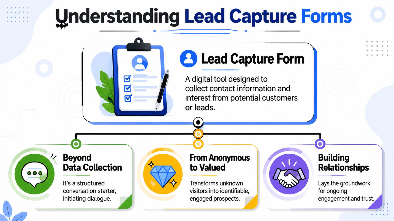
A good form behaves like a concierge. It welcomes people, asks only what's needed, and guides them toward the right next step.
A bad form behaves like a bouncer. It demands too much too early, uses vague labels, and gives the person no clear reason to continue.
That distinction matters because the form is often the first direct interaction someone has with your organization. Before they attend your annual meeting, talk to a sponsor, or join a committee, they meet your form.
Associations usually need lead capture forms to support at least three different workflows.
Registration and attendance
Event registration forms don't just collect names. They determine ticket types, dietary needs, member status, session interest, and consent preferences. If the form is clumsy, the attendee feels it immediately.
Sponsor and exhibitor lead capture
On a show floor, speed matters. Exhibitors need a quick way to identify interest, capture follow-up details, and distinguish casual traffic from real buying conversations.
Content and community growth
White papers, webinar replays, research briefings, and membership guides all create demand. A smart form turns content interest into a tagged contact your team can nurture.
If your team is refining how forms support the top and middle of the funnel, it also helps to understand inbound and outbound sales so you know when a form should invite, qualify, or route.
The form isn't the conversion. It's the handshake that makes a real relationship possible.
When teams treat forms as isolated widgets, they optimize for submissions. When they treat them as relationship infrastructure, they build better member journeys and better sponsor reporting.
Most low-performing forms suffer from the same problem. They ask for too much before they've earned enough trust.
That doesn't just feel inconvenient. It shows up in completion behavior. A 2025 Typeform analysis of 10,000 customer forms found that adding a question to the welcome screen was associated with a 5% decrease in completion rate. For event and association teams, that finding reinforces a basic rule. Don't add friction before you've explained the value.
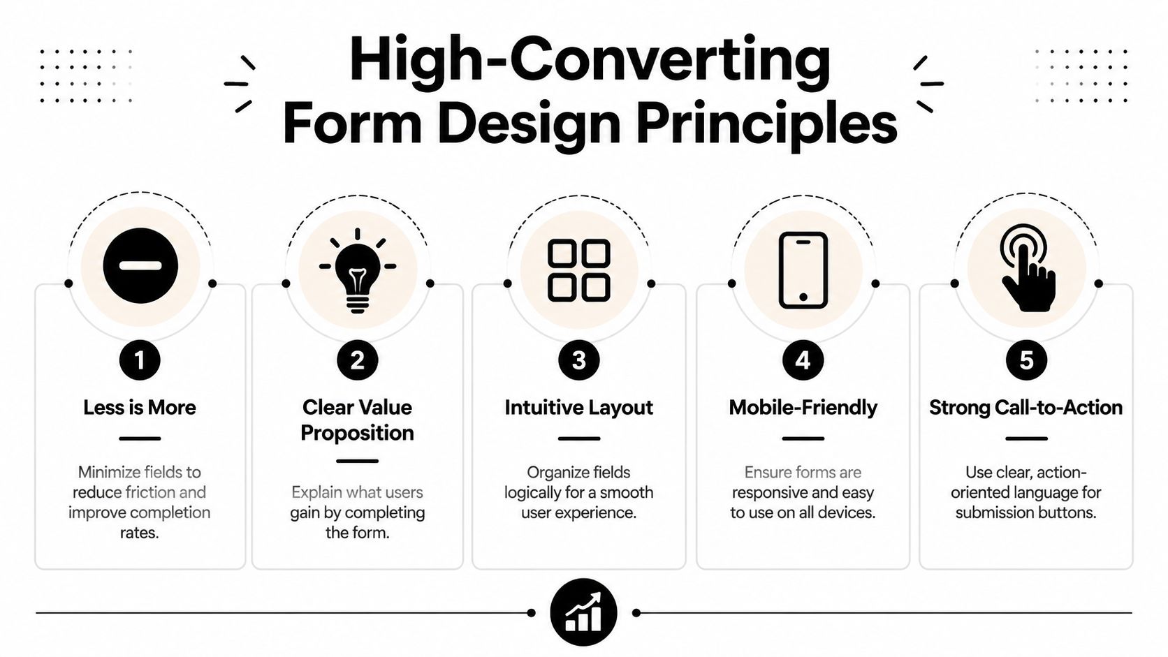
Every field needs a reason to exist. If a field doesn't help routing, qualification, personalization, or compliance, cut it.
A practical review usually looks like this:
Many event and sponsor interactions happen on mobile. Your form should reflect that.
Technical guidance for higher-converting forms emphasizes single-column layouts and conditional logic because they reduce cognitive load and keep the experience linear. That structure also fits how people naturally scroll on phones. If you want a practical companion for the page around the form, these best landing page practices for lead generation pair well with form-level improvements.
This walkthrough is worth watching before you redesign your next registration flow.
"Submit" is lazy copy. It tells people what the system does, not what they get.
Use button text that matches the outcome:
| Form type | Weak CTA | Better CTA |
|---|---|---|
| Event registration | Submit | Reserve My Spot |
| Sponsor inquiry | Send | Request Sponsor Details |
| Webinar replay | Continue | Get the Recording |
| Membership interest | Submit | Send Me Membership Info |
A strong CTA should answer the question, "What happens when I click?"
A form converts better when the button feels like the next step in a decision, not the end of a chore.
People don't just abandon forms because they're long. They abandon them because something feels unclear.
Use short trust signals near the action point:
If you're rebuilding the full experience around event offers, sponsor pages, or gated content, this guide on how to design landing pages helps connect form UX with page intent.
Many stop at form design. The stronger move is to make the form adaptive and harder for bots to abuse without making humans suffer.
You don't need to collect everything on day one.
If someone downloads a policy brief, ask for basic contact details and one relevant qualifier. If they later register for a webinar, ask a different question. Over time, your record becomes richer without front-loading the burden.
That approach works especially well for associations with long relationship cycles:
This gives staff cleaner data and gives the user a more respectful experience.
A lot of teams still treat CAPTCHA as the automatic answer to spam. That's often a conversion mistake.
According to 2026 industry data, CAPTCHAs reduce form completion rates by 12% to 15%, while honeypot fields block 99% of spam with zero impact on user flow. The same analysis reports an 18% increase in lead volume after switching from CAPTCHA to honeypot-based protection. For associations with sponsor forms, event registrations, and high-volume inquiries, that's not a minor UX detail. It's a meaningful trade-off.
A honeypot field is a hidden field that human users don't interact with, but many bots will fill automatically. If that hidden field contains data, the system flags the submission as spam.
Remove visible friction first. Most legitimate prospects won't tolerate being treated like a bot.
The CAPTCHA problem gets worse in event environments because urgency is high. People register between meetings, on phones, or while walking a trade show floor. Every extra challenge lowers the odds that they finish.
If you're comparing broader acquisition tactics around forms, paid outreach, and follow-up, this roundup of B2B lead generation strategies is useful context. But on the form itself, the practical advice is simple: hide complexity from users and surface only what helps them complete the action.
Submission count is the laziest metric in form analysis. It tells you what happened after the fact, but not where the friction lives.
Teams that improve lead capture forms consistently track behavior inside the form, not just at the end of it.
A better measurement setup includes these:
Field-level review is where most useful decisions come from. If users regularly stop at "Phone," maybe the field feels too intrusive for the offer. If they stall at "Organization Type," the options may be confusing.
You don't need a huge experimentation program. Start with changes that clearly alter friction or clarity.
A solid testing queue for associations looks like this:
CTA copy
Compare a generic action against an outcome-based button.
Field count
Remove one nonessential field and watch whether completion quality changes, not just volume.
Field order
Move the most natural questions earlier. Save uncommon or sensitive fields for later.
Page-message match
Make sure the headline, offer, and form CTA all describe the same value.
A low conversion rate doesn't always mean the offer is weak. Sometimes the page attracts the wrong visitor. Sometimes the form asks questions that belong later in the relationship. Sometimes the mobile layout is doing silent damage.
A simple review matrix helps:
| Metric issue | Likely cause | First fix to test |
|---|---|---|
| High starts, low finishes | Too much friction inside form | Remove or defer fields |
| Slow completion time | Confusing labels or layout | Simplify wording, single-column flow |
| Drop-off at consent area | Trust gap | Clarify privacy and next step |
| Strong submissions, weak follow-up outcomes | Poor qualification | Improve field intent and routing |
The point of testing isn't to chase vanity numbers. It's to learn which version gives staff and sponsors cleaner, more actionable leads.
The most useful lead capture forms are built around the moment they're serving. Registration needs clarity. Booth-side capture needs speed. Sponsor inquiries need qualification without intimidation.
Here's what that looks like in practice inside a unified event and community workflow.

A strong registration form starts simple and branches only when necessary.
A member selects a ticket. The form recognizes membership status and reveals the relevant pricing path. If the attendee selects a VIP upgrade, the form shows the added options. If they register for workshops, session choices appear. If they indicate dietary restrictions, that field opens at the right moment instead of cluttering the first screen.
That's where conditional logic does real work. It shortens the visible form while still collecting the detail operations teams need.
Fast forms don't ask less by default. They ask only what's relevant.
An exhibitor form should work with almost no typing.
The ideal booth-side flow looks like this:
For event organizers, the win isn't just that sponsors collect names. It's that sponsors receive usable records while the association retains cleaner reporting on engagement patterns. This is the same operational logic behind stronger trade show lead capture programs.
This is one place where GroupOS is a practical fit. It supports forms, landing pages, ticketing, sponsor visibility, and contact management in one environment, which makes custom fields and follow-up workflows easier to manage than a stack of disconnected point tools.
That matters when your annual conference isn't a single event. It's a lead engine for membership, sponsorship, education, and year-round community participation.
A form isn't valuable because it collects data. It's valuable because the right people can act on that data immediately.
That means integration is not optional. If staff still exports CSV files, cleans columns by hand, and uploads records into separate tools, the form is only solving the smallest part of the problem.
Technical guidance for high-conversion forms stresses conditional logic and single-column layouts, but it also makes a more important operational point: when forms connect to CRM workflows, they need real-time syncing and precise field mapping so the captured data is immediately usable for routing and segmentation, as outlined in this Chilipiper analysis of lead capture form integration requirements.
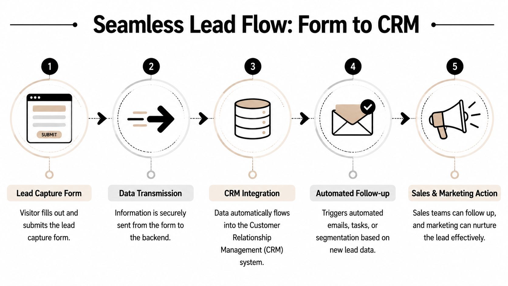
When the stack is connected properly, this is what happens after submission:
Associations often collect data across membership, education, sponsorship, and event programs. That raises privacy expectations quickly.
Make sure your forms include:
| Area | What to include |
|---|---|
| Consent | Clear opt-in language when follow-up is expected |
| Privacy | A visible privacy policy link |
| Purpose | Plain wording on what the person is signing up for |
| Data handling | Internal field mapping that preserves consent status |
If your current stack keeps breaking at the sync layer, these common data integration challenges will probably look familiar.
The underlying rule is simple. Your lead capture forms should feed the same operating system your team uses to run member communication, event engagement, and sponsor fulfillment. Otherwise, every successful submission creates more work instead of more momentum.
If your association is trying to connect registrations, member records, sponsor lead flow, and post-event follow-up without juggling disconnected tools, take a look at GroupOS. It combines forms, landing pages, ticketing, contact management, and community workflows in one platform, which makes lead data easier to collect, route, and use.