May 12, 2026
You publish a post for your members. It's thoughtful, polished, and tied to a real priority. A day later, almost nobody has passed it along.
That usually isn't a content-quality problem. It's a shareability problem.
In professional communities, people don't share for the same reasons consumers do on a public feed. They share when a post helps a colleague, gives context to an event, makes them look informed, or saves someone else time. If you're trying to learn how to make a post shareable, that distinction matters more than any generic “go viral” advice.
A lot of strong posts fail because they ask too much from the reader. The member has to understand the point quickly, trust the link, know who it's for, and feel confident that forwarding it won't waste someone else's time. If any one of those breaks, the share dies.
That's why shareability should be treated like a system, not a creative accident. Format matters. Relevance matters. Friction matters. Timing matters. In member communities, those variables work together.
One reason this matters so much is simple: shareable content can lead to seven times more traffic to websites, according to Sprout Social's reporting on social media shares. That isn't just a public social metric. It's a reminder that the right post keeps traveling after you publish it.
In professional networks, a share says something about the person doing it. They're telling coworkers, peers, or members, “This is useful,” “This is relevant,” or “This helps explain what matters.” If your post doesn't help the sharer send one of those signals, it won't move.
The fastest way to improve that is to stop writing posts only for direct consumption. Write them for second use. Ask:
If the answer is no, the post may still get views. It probably won't get redistributed.
Shareability starts before the share button. It starts when the reader immediately understands why this would help someone else.
That's also why broad social advice often misses the mark for associations and member organizations. Public engagement tactics can help, but they don't replace audience fit. For a more general baseline on channel behavior and posting patterns, these social media best practices are a useful companion. Impact happens when you adapt those principles to the way professionals share.
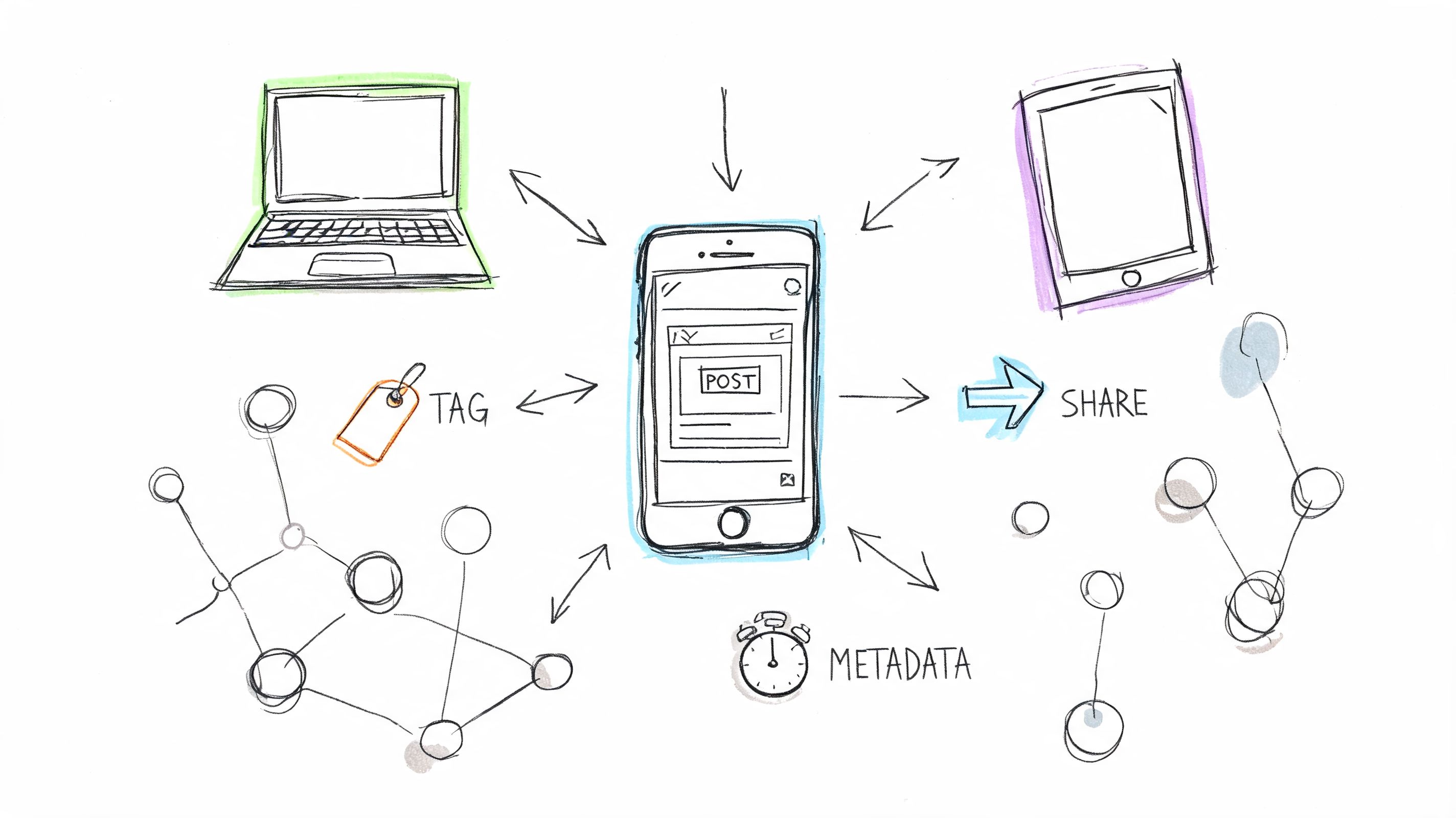
A post can't spread if the link preview looks broken, the title gets mangled, or duplicate URLs split attention. Before anyone evaluates your message, platforms evaluate your metadata.
That technical layer is invisible until it fails. Then it becomes the only thing people notice.

LinkedIn, Facebook, and many messaging apps rely on Open Graph tags to decide what appears when someone shares your link. If you don't define them, the platform guesses. Guesses are where weak previews come from.
Use Open Graph to control four basics:
A simple example looks like this:
<meta property="og:title" content="How to Make a Post Shareable for Professional Communities"><meta property="og:description" content="A practical guide to creating posts people actually forward inside member and event networks."><meta property="og:image" content="https://example.com/images/shareable-post-guide.jpg"><meta property="og:url" content="https://example.com/blog/how-to-make-a-post-shareable"><meta property="og:type" content="article">The key choice isn't just technical. It's editorial. Your OG title should be shorter and clearer than your page title if your CMS allows it. Social previews reward precision, not cleverness.
If your content gets shared on X, in chat tools that ingest Twitter-style metadata, or through apps that still parse these tags, Twitter Cards help preserve the preview layout.
Use summary cards with a large image for articles where the visual carries context.
<meta name="twitter:card" content="summary_large_image"><meta name="twitter:title" content="How to Make a Post Shareable"><meta name="twitter:description" content="What actually gets forwarded in professional and private communities."><meta name="twitter:image" content="https://example.com/images/shareable-post-guide.jpg">This doesn't change your content. It changes whether the content looks worth clicking when someone else shares it.
Practical rule: If a preview appears generic, many members assume the content is generic too.
If the same article exists under multiple URL variants, platforms and analytics tools can treat them as separate assets. That creates messy reporting and weakens consistency when people copy links from different paths.
Set a canonical tag on the preferred version:
<link rel="canonical" href="https://example.com/blog/how-to-make-a-post-shareable">Also keep your permalink clean. Remove unnecessary parameters from public-facing versions whenever possible. A copyable URL earns more trust than a long string of tracking clutter.
Here's a quick working checklist:
| Element | What it does | Common failure |
|---|---|---|
| Open Graph tags | Controls social previews | Wrong image or missing description |
| Twitter Cards | Improves preview formatting on supported platforms | Small or incomplete share card |
| Canonical tag | Consolidates the preferred page URL | Duplicate versions fragmenting attention |
Technical setup only gets you to the starting line. Distribution still matters. If you're building a publishing workflow around newsletters, clips, and repurposed assets, this guide to effective content distribution strategies is useful because it connects publishing decisions to actual reach.
If you're working on this inside a branded member platform, designing a social networking site also affects how cleanly links, previews, and content modules behave once members start passing them around.
A member should never have to hunt for the share action. If they have the intent but feel friction, the moment passes.
That's what makes UI and UX so decisive here. The content may be strong, but the interface decides whether that strength turns into movement.

Many teams place share buttons because templates include them. That's not the same as placing them where readers want them.
A better rule is to match placement to reading behavior:
Too many platforms cram every network into one row. That usually lowers action. In professional contexts, fewer options are stronger. Choose the channels your audience uses.
A lot of sharing doesn't happen through a formal share button. It happens through copied links, screenshots, Slack forwards, and pasted snippets. That means your UX should support informal sharing too.
Focus on these details:
For teams refining these interactions, a solid user interface design testing guide helps validate whether your design supports action or blocks it.
A hidden share option is often equivalent to having no share option at all.
The best shareable posts often include components that travel independently. That could be a chart, a compact framework, a short quote block, or an embeddable graphic.
Consider adding:
A post becomes more shareable when it doesn't insist on being shared only one way. Good UX leaves room for links, screenshots, copy-paste excerpts, and embeds.
A member leaves your annual summit with one useful slide, one clear benchmark, and one sentence they can repeat to their team on Monday. That is the kind of post people share in professional communities. They are not passing along content to fill a feed. They are circulating something that helps them do their job, brief a colleague, or strengthen their standing with peers.
Technical setup and interface choices help distribution. Content creates the reason.
That reason is usually practical. A share can help the sender look informed, save someone else time, frame a decision, or turn a vague discussion into a concrete next step. In private and member-based networks, those motives matter more than broad attention.

Professional audiences do respond to emotion. They just expect it to lead somewhere useful.
According to ASK Training's write-up on shareable content techniques, emotional resonance combined with original data can multiply shares compared to purely informational content. The same source notes that posts featuring joy, awe, and inspiration often outperform standard educational posts.
The trade-off is simple. Emotion can earn attention, but utility earns redistribution. If a post creates a reaction without giving members something they can cite, apply, or forward, the sharing cycle stops early.
In practice, the strongest community content pairs a feeling with proof:
That might be a member benchmark report with one surprising finding, a post-event recap that shows measurable progress, or a short expert clip paired with a chart that chapter leads can reuse in their own discussions.
Many teams publish commentary when they should publish working material. Commentary can signal a point of view. Working material gives members something they can carry into a meeting, client conversation, or volunteer planning session.
The easiest editorial test is this. Can a reader use the post in their next professional interaction without rewriting it from scratch?
Useful formats include:
This is one reason long-form posts still earn shares in B2B and community publishing. Backlinko's analysis of 912 million blog posts, cited in Benchmark Email's article on shareable content, found that posts between 1,000 and 2,000 words tend to perform well for social shares. In practice, that length gives you room to explain the problem, include examples, and add one or two portable insights that members can lift into newsletters, Slack threads, or team updates.
The share happens when a reader can name the coworker, chapter lead, or member who would benefit from the post.
Even strong content stalls when the reader has to work too hard to figure out who it is for.
Researchers at the University of Pennsylvania, summarized by The New York Times in its coverage of why people share, found that people are more likely to pass along information they see as relevant to themselves and useful in their relationships. That matters even more in private communities, where members are usually sharing with a specific colleague, cohort, or role-based group.
So make the relevance explicit. Do not hide it in paragraph six.
Use editorial cues like these:
For example, “What chapter leaders can borrow from our highest-retention onboarding flow” is easier to share internally than “Lessons from community onboarding.” The first headline tells the member who it serves, what they will get, and why it matters in a team setting.
If you need fresh angles for that kind of practical editorial planning, these PostSyncer content tips are a helpful prompt set for moving beyond generic topic ideas.
A short clip can also carry that relevance quickly when the idea is easier to feel than to read.
The best-performing posts in professional and member-based communities vary in format, but their structure is usually consistent. They give the reader something clear enough to use and specific enough to pass on.
Look for these elements:
Teams that want to improve this editorial layer should also tighten their engagement fundamentals. This guide on how to create engaging content for communities and member-driven brands pairs well with shareability work because engagement and sharing serve different jobs. Likes show interest. Shares show that the content delivered enough value to travel.
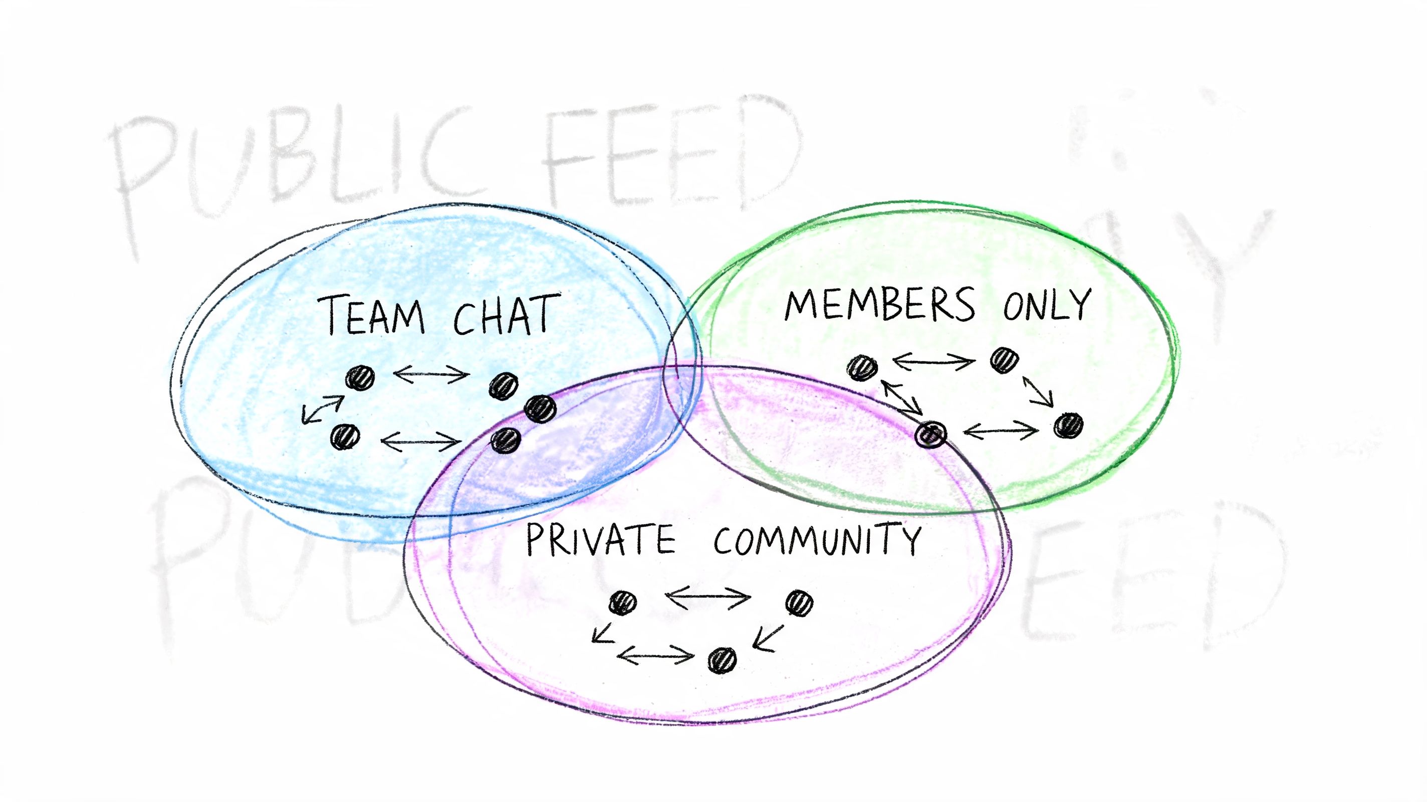
Public virality gets most of the attention. In professional communities, it's often the wrong goal.
The more important question is whether the post moves inside the channels where members already work. That includes Slack, private LinkedIn groups, member apps, chapter spaces, and restricted event communities. In those environments, people are less interested in broadcasting identity and more interested in passing along something useful.
One of the clearest signals in private sharing is that members respond to assets they can immediately use. The post doesn't need to feel viral. It needs to feel transferable.
That lines up with the data summarized by Evergreen Feed: a 2025 Hootsuite report notes 68% of B2B engagement occurs in private channels, but shares drop 40% without internal forwarding tactics. The same source adds that LinkedIn analytics found posts with utility triggers get 2.5x more reshares in groups versus emotional hooks, in its discussion of how to make posts shareable.
A utility trigger is a prompt built into the content that tells the reader exactly how to reuse it.
Examples:
Those prompts work because they lower the cognitive load. The member doesn't have to invent a reason to share. You've already provided one.
Most publishing systems are optimized for publishing outward. Private communities need assets optimized for passing along sideways.
That means designing content with internal movement in mind:
| Content type | Why it gets shared privately | Better execution |
|---|---|---|
| Checklists | Easy to use in team workflows | Put the checklist high on the page |
| Screenshots | Fast to drop into chat threads | Keep visuals clean and legible |
| Recap summaries | Helps absent members catch up | Lead with decisions, not atmosphere |
| Sponsor or member spotlights | Gives others a reason to mention peers | Include a clean visual and one strong takeaway |
In private communities, the winning post often feels less like marketing and more like a working document.
The weakest posts in private spaces are the ones copied directly from public social strategy. They tend to rely on broad inspiration, vague celebration, or polished branding without a practical next step.
Three patterns underperform repeatedly:
A better standard is simple. Every post should help someone do one of these things: brief a colleague, prep for an event, follow up after a session, recognize a member, or make a decision faster.
When you frame private sharing that way, the content gets sharper. So does the distribution.
If you only look at total shares, you'll miss the useful signals. A post can have modest visible share counts and still be doing valuable work inside team chats, member spaces, and follow-up threads.
That's why shareability has to be measured as a behavior pattern, not a vanity metric. The goal isn't just “more sharing.” The goal is to learn what type of post gets passed along, by whom, and in what context.
Start with what your own stack can reliably show. You don't need complicated attribution to improve. You need consistent observation.
Look at:
That last point matters more than many teams realize. Different member groups have different reasons to redistribute content. A sponsor may share visibility. A board member may share utility. An attendee may share proof of participation.
The event ends, the team publishes a recap, and then everyone moves on. That's a mistake.
Post-event content often has the strongest built-in relevance because members already have context for it. They attended. They missed a session. They met someone new. They want a lightweight way to signal involvement.
That's where personalization helps. According to the source material summarized in this brief, AI analytics reveal 55% higher shares for posts with personalized “your highlights” embeds, and attendee-specific video clips can drive 4x forwarding in Slack integrations, as noted in this video-based source on post-event sharing behavior.
Those numbers point to a practical lesson: generic recaps are less portable than individualized ones. If you can package a member's own sessions, check-ins, clips, or milestones into a shareable recap, the post stops feeling like institutional content and starts feeling like personal proof.
Don't treat recap content as an archive. Treat it as a second distribution window.
Every shareable post leaves clues. Which sentence got copied into comments? Which screenshot showed up in Slack? Which format got reused by chapter leaders? That evidence should shape the next asset immediately.
A workable review rhythm looks like this:
If your team wants a cleaner framework for measuring what matters after content goes live, these social media engagement metrics are a useful reference. The most important thing is to connect metrics to decisions. If the data doesn't change the next post, it isn't helping your strategy.
If you need a platform that supports private community sharing, event recaps, member profiles, analytics, and branded communication in one place, GroupOS is built for that kind of engagement engine. It helps professional networks create content that doesn't stop at publish, but keeps moving through the member channels that matter.