March 10, 2026

Client engagement metrics are simply the numbers that tell you if your members are actually showing up, paying attention, and getting value from what you offer. These are the data points—both hard numbers and qualitative feedback—that measure how, when, and why people interact with your community, content, and events.
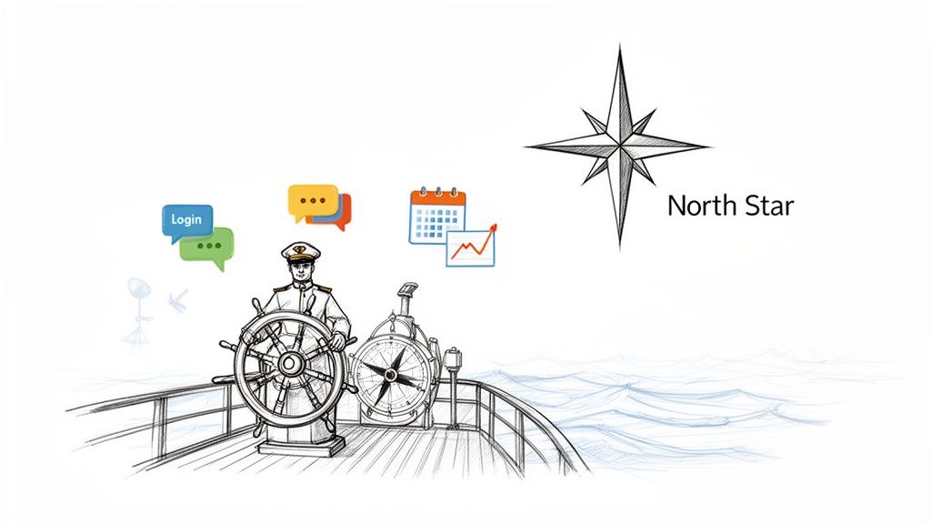
Think of your membership or community as a ship on the open ocean, with you as the captain. Client engagement metrics are your North Star, your compass, and your weather forecast, all rolled into one. They tell you if you're on course, how fast you're going, and whether a storm—like a wave of member cancellations—is brewing on the horizon.
Without these tools, you’re essentially sailing blind. You might feel like things are going well, but you won't know for sure until your ship has already veered off course. Tracking engagement is what separates gut-feeling guesswork from confident, data-driven leadership. It turns abstract feelings into concrete facts.
Just like a doctor monitors a patient's vital signs to assess their health, a community manager needs to keep a close eye on engagement. These numbers aren't just for spreadsheets; they're direct feedback from your members. They reveal the true health of your client relationships and point directly to areas that need your attention.
It’s all about connecting the dots between the numbers and what they actually mean:
These metrics aren't just for show. They're the bedrock of smart decisions. One study found that by increasing customer retention by just 5%, companies can see profits rise by 25% to 95%—and retention is a direct outcome of strong engagement.
When you consistently track client engagement metrics, you can get ahead of problems before they sink your ship. You can spot the members who are drifting away—the ones at risk of "jumping ship" (churning)—and reach out with a targeted email or a personal check-in to bring them back. If you're looking for more ways to do this, our article on the benefits of community engagement is packed with ideas.
At the same time, you'll uncover your most loyal crew members: your super-users. These are the champions who are always in the comments, attend every event, and advocate for your brand. By identifying and empowering these key individuals, you can help them foster an even stronger and more vibrant community for everyone.
In the end, these metrics are fundamental to your community's survival and growth. They give you the clarity to make confident decisions, ensuring your ship doesn't just stay afloat but successfully reaches its destination.
If you can't measure it, you can't improve it. That old saying is especially true when it comes to understanding your members. Quantitative metrics are the hard numbers—the "what," "how many," and "how often"—that give you an objective look at how clients are actually behaving.
These aren't just figures on a spreadsheet; they are the scoreboard for your community's health. By tracking the right numbers, you can stop guessing what members want and start making decisions based on solid evidence. This is how you spot trends before they become problems and prove the real-world value your work is creating.
To get started, it's helpful to have a quick-reference guide for the most important metrics. This table breaks down the key numbers, how to calculate them, and what they tell you about how your members are engaging.
Think of these formulas as the building blocks of your engagement strategy. Each one provides a different piece of the puzzle, and when you put them all together, you get a clear picture of what's working and where you need to focus your efforts.
The first sign of life in any community is activity. Are people logging in? Are they showing up? If the answer is no, then nothing else you do will matter. These fundamental metrics are the pulse of your organization.
Here are the core activity rates you should be watching:
A declining Member Activity Rate isn’t just a line on a chart; it’s a smoke signal. It’s your cue to launch a re-engagement campaign and reach out to those quiet members before they churn for good.
Alright, so your members are showing up. The next question is: what are they doing once they're inside? Interaction metrics help you figure out which content, resources, and platform features are actually hitting the mark.
Think of these numbers as your roadmap for what to create next.
To get a complete picture, you sometimes need to get very specific. For example, detailed form engagement metrics tracking can uncover hidden friction points in your signup or feedback forms that could be quietly hurting the user experience.
This kind of data is easiest to understand when it's visualized.
A centralized dashboard like this makes it easy to see trends at a glance. You can immediately spot patterns in member signups or logins, giving you fast feedback on whether your latest initiative is moving the needle.
At the end of the day, the ultimate test of engagement is whether your clients stick around. Retention-focused metrics are where engagement directly translates into business outcomes like revenue and long-term growth. These are the numbers your stakeholders and leadership care about most.
Keep a close eye on these bottom-line metrics:
While your quantitative metrics tell you what members are doing, they can’t tell you why. That's the missing piece of the puzzle, and it's where qualitative data shines. These metrics capture the human side of your community—the feelings, opinions, and stories behind the clicks and views.
Think of it this way: numbers show you that people are walking a certain path through your community. But qualitative feedback is like stopping someone on that path and asking them about their journey. Are they excited? Confused? Frustrated? Knowing someone logged in is one thing; knowing they logged in and immediately felt overwhelmed tells you a completely different story.
One of the most trusted ways to get a read on member sentiment is the Net Promoter Score (NPS). It's a beautifully simple metric that cuts straight to the heart of loyalty by asking one powerful question: "On a scale of 0-10, how likely are you to recommend our community to a friend or colleague?"
Based on their response, you can sort members into three distinct groups:
The NPS formula is straightforward: subtract the percentage of Detractors from the percentage of Promoters. This gives you a final score somewhere between -100 and +100.
While any score above 0 is considered decent, the real gold isn't the number itself. It’s in the follow-up. Always ask a second, open-ended question like, "What's the main reason for your score?" The answers to that question are where you'll find your roadmap for improvement.
Beyond a formal survey like NPS, your community is a goldmine of unstructured feedback that’s generated every single day. Learning to tune into these conversations is absolutely critical for understanding what it’s really like to be a member.
I’ve seen communities celebrate a high Content Interaction Rate, only to discover the comments were filled with frustration—"I can't find anything," or "This is so confusing." The numbers looked great, but the actual member experience was poor. The "what" was engagement; the "why" was a cry for help.
Here’s how you can start listening more effectively:
When you bring all this feedback together, you can turn vague feelings into specific projects. The sentiment "overwhelmed" can lead you to simplify your onboarding process. The feedback "disconnected" might inspire you to launch a peer-to-peer connection program. This is how you use qualitative metrics to build a community that people don't just join, but one they truly feel a part of.
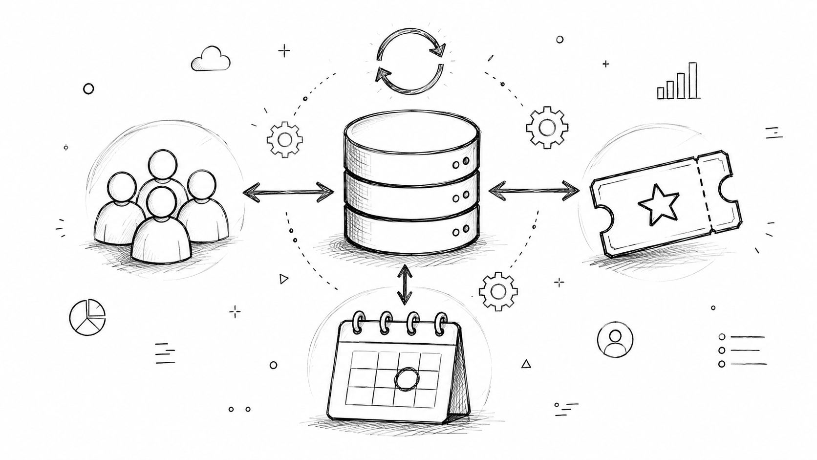
Tracking client engagement is one thing, but actually understanding it requires seeing the whole story. If your data is scattered everywhere—event attendance in one system, member profiles in another, and email stats in a third—you're basically trying to put together a puzzle without half the pieces. It’s a frustratingly common scenario.
This fragmentation is what we call data silos. Each platform holds its own valuable, yet isolated, piece of the puzzle. To get a complete picture of a member's journey, you're stuck in a nightmare loop of manually exporting spreadsheets, cleaning up mismatched data, and trying to force it all together. It's a huge time-waster that, more often than not, gives you outdated and unreliable information.
Trying to stitch together data from different sources by hand is more than just a headache; it’s a real risk to your community’s health. The process is painfully slow, meaning you're always looking in the rearview mirror, reacting to problems from last week instead of getting ahead of them today.
Sound familiar?
By the time you’ve painstakingly matched names and emails across all those files, you might discover that the disengaged member you wanted to reach out to has already left. The manual approach is just too sluggish to keep pace with your members' real-time actions and needs.
The real problem with data silos is they keep you from connecting the dots. You can't see that the same member who came to three webinars last month has suddenly gone cold and isn't opening your emails—a critical red flag that’s completely invisible when your data lives in different places.
The answer is to tear down those silos and bring all your data into a single, unified platform that serves as your central command center. Instead of juggling a dozen different tools, an all-in-one system automatically gathers all your client engagement metrics into one clear, cohesive dashboard.
With this integrated approach, you get a genuine 360-degree view of every single member. You can instantly trace their entire journey—from the very first event they signed up for to the latest discussion they participated in.
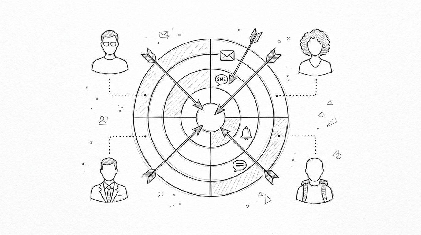
For example, this simple flow shows how you can manage the entire feedback loop—gathering qualitative input, analyzing it for trends, and acting on it—all within one system.
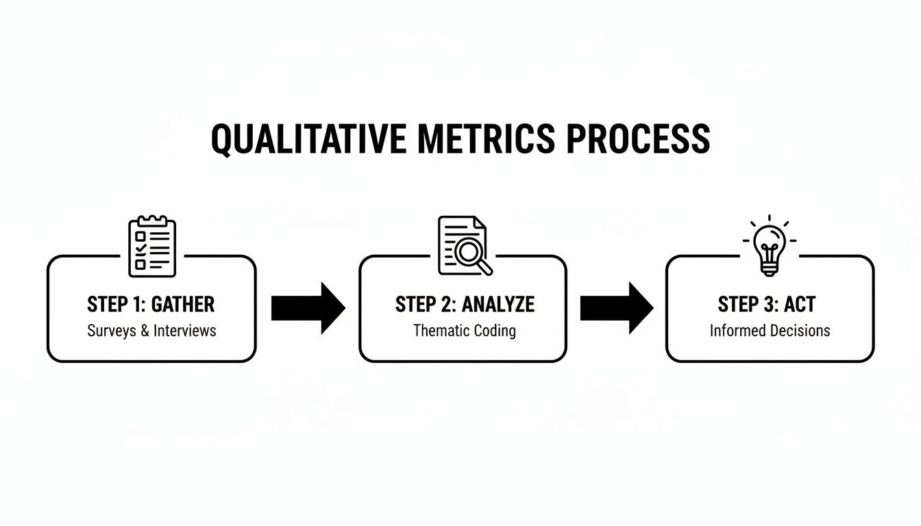
This process—gathering, analyzing, and acting—becomes a simple, repeatable workflow that gives you the power to respond quickly to member feedback without ever having to switch platforms.
A centralized platform like GroupOS turns messy, overwhelming data into one of your most valuable assets. By uniting all your event, membership, and communication data, you can uncover much deeper insights in real time. We dive deeper into this in our guide on leveraging analytics and insights for community growth.
Imagine how a unified dashboard can completely change your daily workflow. Instead of burning hours just to compile a basic report, you get an immediate, at-a-glance read on your community's health. This not only saves you a tremendous amount of time but also empowers you to make smarter, faster decisions that truly move the needle.
Collecting client engagement metrics is a great first step. But on its own, data is just a pile of ingredients. The real magic happens when you start cooking—when you interpret what the numbers are telling you and turn them into something that nourishes your community.
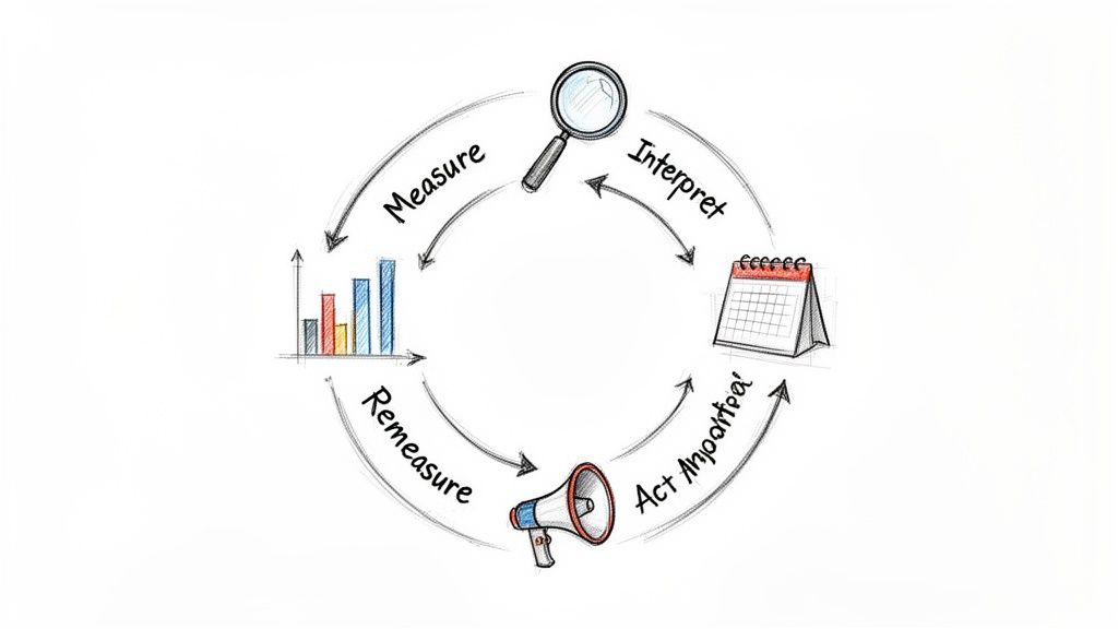
True growth isn't about admiring a dashboard full of impressive-looking stats. It’s about using those stats to make smarter decisions and take decisive action. This is how you create a powerful feedback loop for continuous improvement: Measure, Interpret, Act, and then Remeasure to see what worked.
Here’s a classic example we’ve all seen. Your analytics show that event attendance is fantastic, which feels like a big win. But when you look closer, you realize the community forum is dead silent after the event ends.
The numbers are telling a clear story: people are interested enough to show up, but that excitement vanishes the second the webinar closes. This insight is your call to action. Just knowing the numbers changes nothing; you need a plan to bridge the gap between initial attendance and lasting community interaction.
Here's how you can act on that insight:
This kind of proactive follow-through turns a one-off event into a real community touchstone. Once you’ve made these changes, you circle back to the beginning and measure again. Are people talking more after events? If so, you’ve found a winning play. If not, it’s time to try something new.
This cycle of measure, interpret, and act is the engine of sustainable growth. It transforms your client engagement metrics from static reports into a living, breathing strategy that adapts to your members' needs.
What about the slow fade? Another critical place to apply this thinking is when you see your Member Activity Rate (MAR) start to dip. You notice a group of previously active members hasn't logged in or posted in over 30 days. This is a flashing red light telling you to launch a re-engagement campaign before they churn for good.
A generic "we miss you" email is a waste of time. Your data gives you the power to be much more personal and effective.
Here’s a simple, data-driven plan:
The success of your campaign is measured by a simple metric: did they log back in and get involved? Every interaction gives you more data, refining your understanding of what makes your community tick. To build on this, you can learn how to create loyalty programs that reward the very engagement you’re trying to encourage.
By consistently using this framework, you stop being a data collector and become a growth strategist. You learn to actually listen to your metrics and respond with thoughtful, targeted actions that make your community stronger and more valuable for everyone.
Getting a handle on your client engagement metrics is one thing. Actually using that knowledge without drowning in spreadsheets and a dozen different software tabs is a completely different challenge. This is where a unified platform like GroupOS bridges the gap, turning all that scattered data into a single, straightforward command center.
Instead of just talking about features, let's look at the results. By giving you one place to see every member interaction—from event check-ins and content downloads to forum posts—GroupOS gets rid of the tedious, mistake-prone task of merging data manually. It frees you up to focus on what the numbers are actually telling you.
Think about what it takes to find your most engaged members right now. You’d probably have to pull an event attendance list, export email open rates, and then try to cross-reference all of that with your community forum activity. It’s a slow, frustrating process that, by the time you're done, gives you a picture that's already out of date.
With GroupOS, that entire process happens automatically and in real-time. The platform’s analytics do all the heavy lifting for you, connecting the dots in the background.
This dashboard view gives you a quick, at-a-glance summary of all your member data, including their profiles and activity levels.
It’s a perfect example of how a centralized platform gives you a complete picture of each person, making it easy to track their entire journey with your organization.
Let’s walk through a practical example. A professional association uses GroupOS to manage its annual conference and its year-round membership. By looking at the platform’s engagement heatmaps, the community manager notices that a small handful of members consistently shows up for every webinar and posts daily in the discussion forums. These are their super-users.
Armed with this insight, she creates a special "Ambassador" program, offering these members exclusive perks and a direct line of communication with the association's leadership. This doesn't just reward their loyalty; it builds a passionate volunteer team to help welcome new members and keep the community vibrant. If you're exploring how to consolidate your own tools, our guide to choosing a great customer engagement platform is a great place to start.
A unified platform transforms client engagement metrics from a complex reporting chore into a true strategic advantage. It gives you the clarity to act decisively and the proof to show your impact.
Ultimately, mastering these metrics isn't about becoming a data scientist overnight. It’s about having the right system to turn raw numbers into clear, actionable insights that help your community grow. GroupOS provides that streamlined path, making a data-driven strategy an achievable reality for any organization.
Even the best measurement strategy runs into real-world questions once you start putting it into practice. Let's tackle some of the most common ones we hear from managers who are getting serious about tracking client engagement metrics.
This is a fantastic question, and the distinction is critical. The simplest way to think about it is that engagement is about behavior, while satisfaction is about feeling.
Engagement is what your clients physically do—logging in, joining a discussion, or showing up for an event. Satisfaction is their perception of the value they're getting, which you'd typically capture with a survey like NPS or CSAT.
They're two sides of the same coin, but they tell different stories. High engagement with low satisfaction is a huge warning sign that something is wrong. On the flip side, a satisfied member who isn't engaging is an opportunity you're missing. You really need to track both to get the full picture.
The right rhythm for reviewing your data depends entirely on what you're measuring and how quickly your community moves.
If you’re not sure where to begin, a monthly metrics review is a solid starting point. It's frequent enough to catch issues early but spaced out enough that you won't get lost in day-to-day noise.
Feeling overwhelmed is completely normal—don't feel like you have to track dozens of numbers from day one. The key is to start small and focus on what truly matters to the health of your community.
If you're just starting out, zero in on these three core metrics: Member Activity Rate (MAR) to see if people are showing up, Content Interaction Rate to check if they're participating, and Churn Rate to know if they're staying. Mastering these three gives you an immediate, powerful snapshot of your community's health.
Once you’ve got a good handle on those, you can gradually layer in other metrics like event attendance or NPS. This builds your understanding progressively without the pressure of tracking everything all at once.
Ready to stop guessing and start growing? GroupOS consolidates all your client engagement metrics into one clear, actionable dashboard. See exactly what’s working, identify at-risk members, and prove your community's ROI with ease. Get a free demo of GroupOS today.