April 14, 2026
A thanks you page gets overlooked because it feels administrative. Someone registers, buys, downloads, or joins. You confirm the action and move on.
That’s a mistake.
The moment after conversion is usually the highest-trust moment in the journey. The person has already acted. They’re paying attention. They want reassurance, details, and direction. If you give them only “Thanks, you’re all set,” you waste one of the few moments when attention and intent are both high.
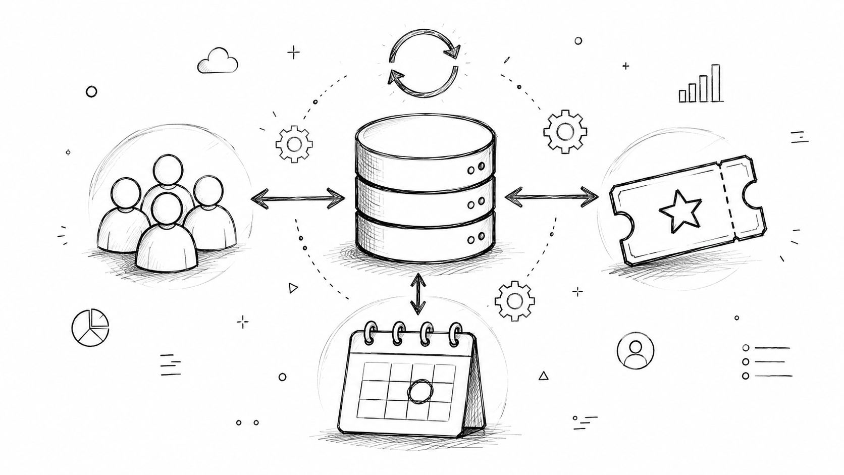
For event teams and membership managers, this page matters even more than it does in standard ecommerce. You’re not just confirming a purchase. You’re onboarding an attendee, preparing a member, introducing sponsors, delivering QR access, and moving someone into a community experience that continues long after the first click.
The clearest reason to take this seriously is simple. The probability of selling to an existing customer is 60-70%, compared to 5-20% for a new prospect, according to BizBudding’s thank you page analysis.
That stat changes how you should think about a thanks you page.
A person who just registered for your conference, renewed a membership, or claimed a seat for a webinar is no longer cold traffic. They’ve crossed the hardest line already. The page they land on next shouldn’t behave like a receipt. It should behave like a guided handoff.
Most organizations underuse this moment in three predictable ways:
For event and membership businesses, this page can do real work. It can reduce support tickets, improve attendance readiness, surface sponsor value, and move people into a stronger onboarding path.
A good thank you page closes the first transaction and opens the next relationship.
That’s a significant opportunity. If someone has just said yes once, your job is to make the next yes easy. That might be a VIP add-on, a community profile completion, a private discussion group, or a sponsor introduction that helps the attendee.
The page is small. The role isn’t.
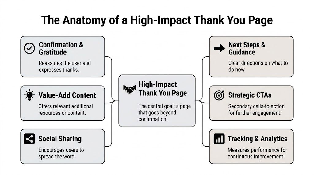
A strong thanks you page has a job hierarchy. First, confirm. Second, orient. Third, extend the relationship.
If you skip the first part, people get anxious. If you skip the second, people get lost. If you skip the third, you leave value on the table.
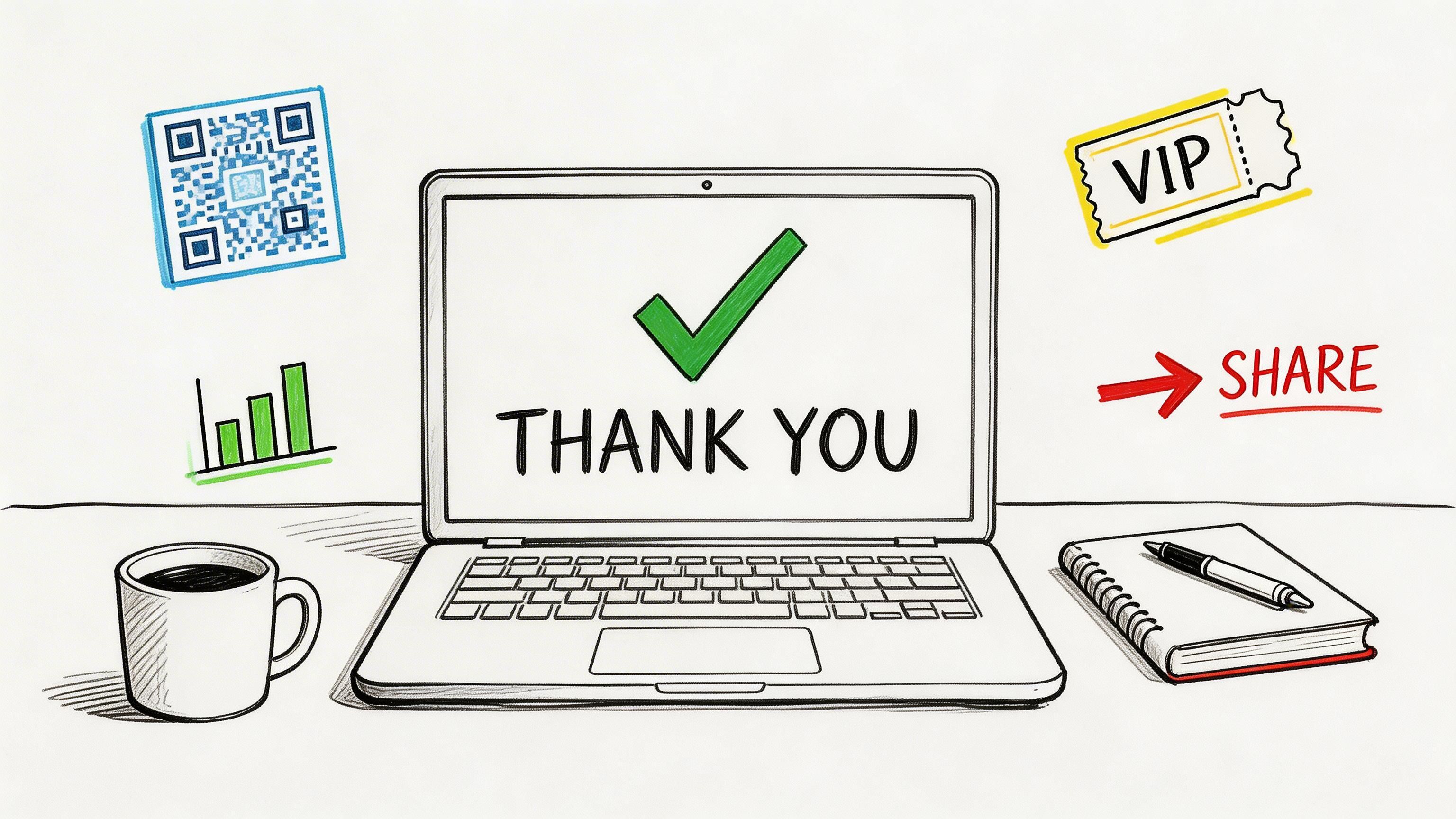
The first screen should answer the user’s immediate question: did this work?
Use plain language. “Your registration is confirmed.” “Your membership is active.” “Your download is ready.” Avoid vague copy that sounds polished but leaves doubt.
Then thank them like a human. That’s not fluff. Research summarized by Personify’s member appreciation stats found that over 90% of American teens and adults report feeling extremely happy or somewhat happy when gratitude is expressed, and 91% are more likely to do business with appreciative companies.
That makes appreciation functional, not decorative.
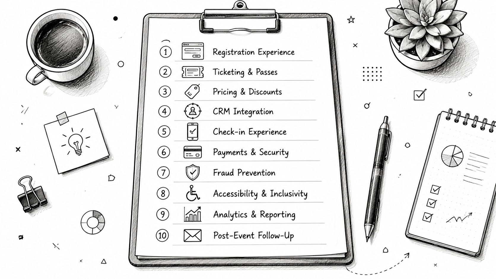
Core framework: Confirm the action. Guide the next step. Deepen the relationship.
Event and membership teams are capable of outperforming generic marketers.
A registrant needs operational clarity. A new member needs onboarding clarity. A sponsor lead needs handoff clarity.
Include specifics such as:
A vague thank you page creates follow-up work for your team. A precise one prevents it.
Many pages often fail. They either offer nothing, or they throw five unrelated buttons at the visitor.
Choose one primary post-conversion action and one secondary action. That’s enough for most flows.
A simple way to structure it:
| Element | What it should do |
|---|---|
| Primary message | Confirm the completed action |
| Primary next step | Help the user use what they just bought or joined |
| Secondary CTA | Introduce a relevant follow-on action |
| Support content | Reduce uncertainty with logistics, FAQs, or a short video |
Useful support content might include a short welcome video, a session-selection prompt, a member benefits explainer, or a checklist for first-time attendees. If you need a broader framework for how these pages connect to form completion flows, Orbit AI’s guide on how to optimize your thank you page is a solid reference.
The thank you page should feel like a continuation of the registration or sign-up experience, not a dead-end microsite with mismatched tone and design. If your landing pages are inconsistent, fix that upstream too. This breakdown of https://groupos.com/blog/how-to-design-landing-pages is useful because the page before conversion and the page after conversion should feel like one journey.
If the registration page promises simplicity and the confirmation page creates doubt, users remember the doubt.
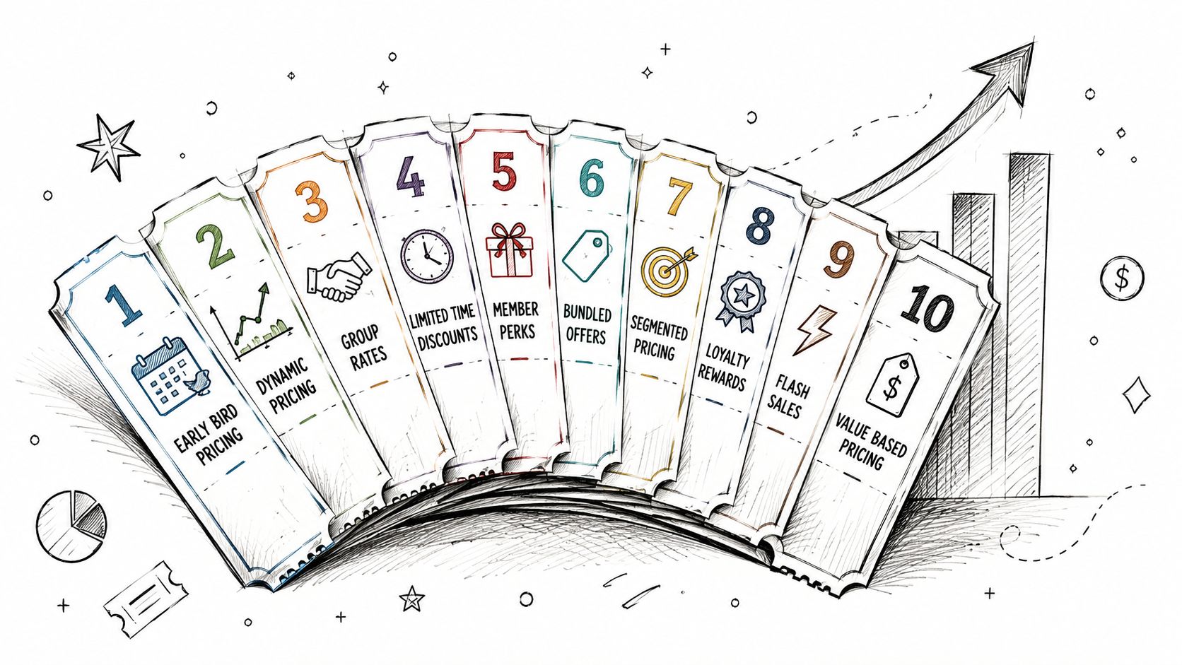
The easiest thank you page revenue win is relevance. Not pressure. Not gimmicks. Relevance.
If someone just bought a standard event ticket, the best upsell isn’t a random unrelated product. It’s usually a tighter version of the same commitment. Better seating. Better access. Better networking. Better visibility. For members, it might be a premium tier, a paid subgroup, or access to a deeper content library.

An attendee registers for a general admission pass to an industry summit.
They land on the thanks you page. The top of the page confirms the registration and tells them their check-in instructions are on the way. Below that, they see one well-placed offer: upgrade to VIP access for speaker Q&A, premium seating, and a private networking session.
That works because the context is still live in their head. They haven’t moved on yet.
The offer should answer three questions fast:
What works:
What doesn’t:
A/B testing a secondary CTA for upsells on a thank you page has shown a 15-30% uplift in conversions from cold traffic funnels, according to Local SEO Tactics. That matters because even if your original acquisition path did the heavy lifting, the thank you page can still materially improve revenue per registrant.
One useful pattern is to test the format, not just the wording. Compare a text link against a card layout. Compare an “Upgrade now” button against “See VIP benefits.” Compare a benefit-led message against an access-led message.
For event teams thinking about ticket progression, this resource on https://groupos.com/blog/ticket-level-up is worth reviewing because the strongest thank you page offers usually mirror the logic of your ticket strategy.
If the upgrade or add-on needs more context, a short video can carry the message better than extra copy.
The best upsell on a thank you page feels like help, not interruption.
That’s the standard. If the offer improves the attendee or member experience, it belongs here. If it only serves your revenue target, users will feel it immediately.
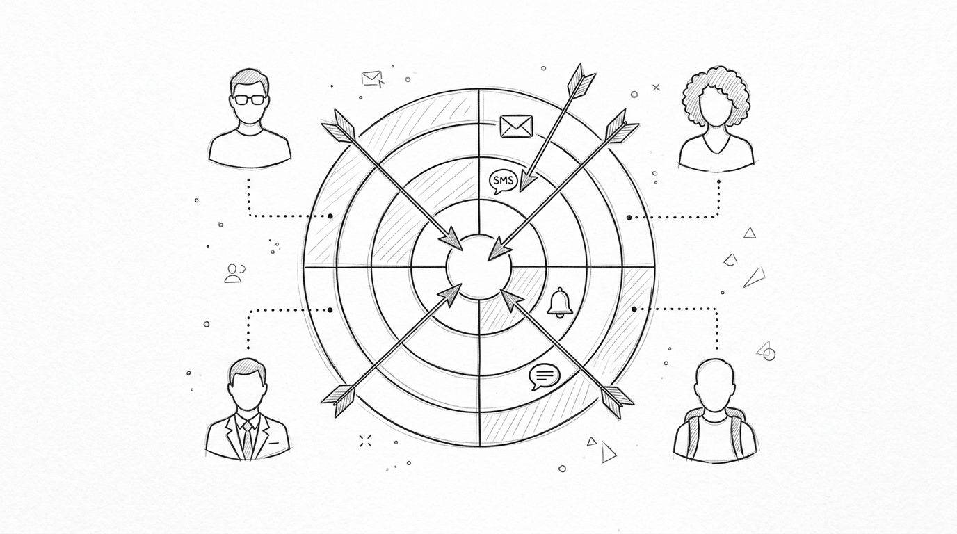
A generic thank you page treats every converter the same. That’s easy to launch and hard to defend.
An attendee with a general admission ticket doesn’t need the same next steps as a speaker, sponsor contact, exhibitor rep, or board-level member. The page should reflect that difference.
Start by changing the content based on what the person just did.
A few examples:
This isn’t personalization for its own sake. It reduces confusion and makes the post-conversion moment feel competent.
Teams often over-rely on email. Email still matters, but the thank you page is your one guaranteed immediate touchpoint.
If the user needs something next, give it to them there when your system allows it:
The strongest implementations use the registration data already captured to decide what appears. Ticket type, membership level, role, and source all help shape the right next step. If you’re refining that logic, this guide to https://groupos.com/blog/customer-segmentation-models is useful because your segmentation model should influence post-conversion content, not just email campaigns.
Too many teams hide useful logic behind overcomplicated layouts.
Make the page read like this:
That’s enough.
Personalization works best when the user notices relevance, not complexity.
There’s also a practical trade-off. The more dynamic your page becomes, the more important QA becomes. Test every route. Test every ticket type. Test the path for expired sessions, mobile devices, and users who return to the page later. A personalized thanks you page that breaks for one role creates more damage than a simpler one that works consistently.
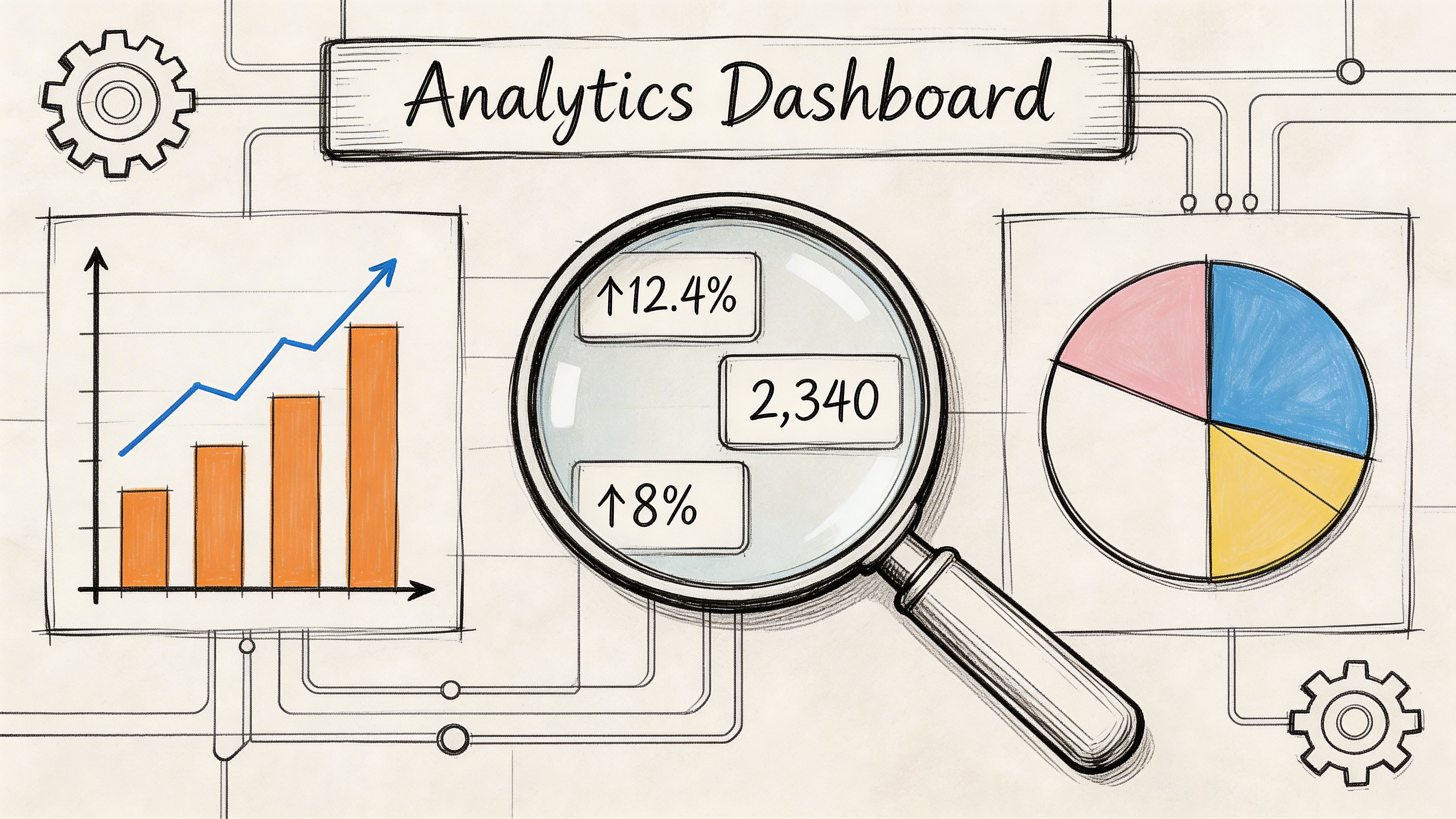
Teams commonly know how many registrations happened. Far fewer can tell you what happened after registration on the thank you page itself.
That’s a missed measurement layer.
A dedicated thank you page gives you cleaner attribution and a better read on what happened before and after the conversion. According to Bluleadz, redirects to dedicated thank you page URLs enable 100% accurate conversion attribution versus 70-80% with inline confirmations.
Inline “success” messages are convenient for design. They’re weaker for analysis.
A unique URL lets you track:
That’s operationally useful because event and membership journeys don’t stop at the transaction.
Don’t evaluate the page on one metric alone. A page can confirm conversion perfectly and still fail at onboarding.
A practical review set looks like this:
| Metric | Why it matters |
|---|---|
| Thank you page views | Confirms successful completions |
| Secondary CTA clicks | Shows whether post-conversion offers are relevant |
| Video or asset engagement | Indicates readiness and onboarding interest |
| Sponsor or exhibitor interactions | Measures partner value creation |
| Exit behavior | Reveals whether the page keeps people moving |
If you want a broader optimization lens around this work, Statspresso’s guide to website conversion optimization is a useful companion because the thank you page should be part of your conversion system, not an afterthought after forms are submitted.
For event and membership teams, the thank you page can answer questions that matter outside the marketing department.
For example:
Those insights can improve onboarding, reduce support requests, and help you defend partner packages internally.
Practical rule: If the page can influence behavior, instrument it.
That includes clicks, media engagement, and route-specific behavior. Don’t stop at “conversion happened.” The useful work starts after that.
Most thank you page advice assumes a consumer sale. Event and membership organizations have a different advantage. Your post-conversion page can create value for attendees and for partners at the same time.
That’s especially true when sponsors and exhibitors need qualified visibility, not generic impressions.
A registrant who just committed to your event is a strong candidate for relevant sponsor discovery, but only if the page respects context.
Useful examples include:
This works best when sponsor exposure feels assistive. A “Meet the partners aligned with your interests” block lands better than a banner that interrupts the confirmation experience.
There’s one tactic many event teams ignore. A small follow-up form on the thank you page can help qualify intent for sponsors and exhibitors.
HubSpot data, cited by Bruce Clay, shows post-conversion forms on thank you pages can capture 22% more qualified leads.
The important word is qualified.
If someone already registered, a short follow-up form can ask for role, buying responsibility, product interest, or which exhibitor category they want to hear from. That’s far more useful to sponsors than a raw registration list.
What matters is restraint:
If you’re packaging sponsor value more intentionally, https://groupos.com/blog/how-to-create-a-sponsorship-package can help frame how this kind of post-conversion engagement supports a stronger partner offer.
Sponsors care less about being seen than about being seen by the right people with clear intent.
That’s why the thank you page is so underused in B2B event strategy. It sits at the exact point where attendee intent is freshest, yet many organizations reserve it for a generic message and a logo strip. A better version can support attendee planning, improve sponsor lead quality, and make your sponsorship inventory easier to justify.
Yes.
For a free event, the page should focus on attendance commitment. Add calendar links, speaker highlights, and one action that increases show-up likelihood, such as profile completion or session selection.
For a paid event, the page should focus on confidence and readiness. Confirm payment-dependent access, explain check-in logistics, and show any upgrade or add-on that is still relevant.
Usually one primary next step and one secondary action is enough.
The page already has one mandatory job, which is confirmation. If you overload it with options, users stop seeing the most important one. For event and membership flows, clarity usually beats volume.
If your platform supports it cleanly, yes.
Immediate delivery reduces anxiety and makes the action feel complete. Still send the asset by email when needed, but don’t force users to wait for email if they need reassurance right away.
A dedicated page is usually better when you care about analytics, post-conversion actions, and structured onboarding.
Inline confirmations can work for simple flows. They’re weaker when you want reliable tracking, segmented next steps, or distinct offers after registration.
Test one thing at a time and leave the core confirmation block alone.
Good test candidates include:
Don’t test changes that make users question whether their registration or sign-up succeeded.
A failed transaction should never land on the same thank you page as a successful one.
Use a separate failure state that explains the issue in plain language, preserves user-entered context where possible, and gives one obvious next action, such as retry payment or contact support. The tone should stay calm and specific. “Your payment didn’t go through” is more useful than “Something went wrong.”
If your organization needs a platform that connects registrations, memberships, content delivery, sponsor visibility, private channels, and branded community experiences in one place, take a look at GroupOS . It’s built for associations, event teams, and membership businesses that want the post-conversion experience to be as strong as the conversion itself.