January 24, 2026
Before you even think about colors, fonts, or fancy animations, you need to get brutally honest about one thing: what is the one job this landing page has to do?
Every high-converting landing page is built on a foundation of a single, non-negotiable goal. Whether you want someone to register for an event, sign up for a membership, or start a free trial, every single element on the page—from the headline down to the button—must push them toward that one action. It’s this ruthless focus that turns casual visitors into committed community members.
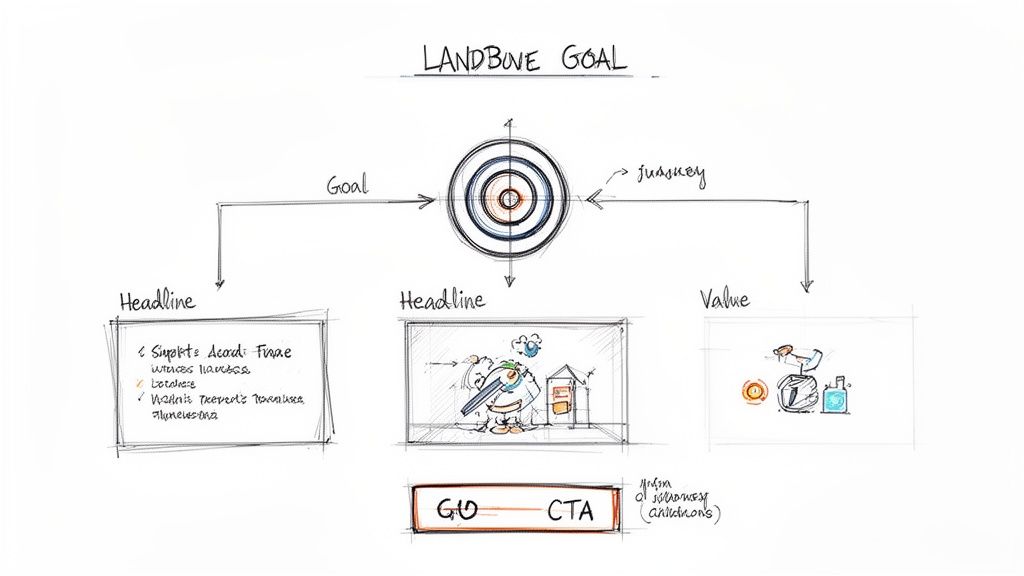
So, before you write a single word of copy or pick a hero image, stop and answer this question with absolute clarity: What is the single most important action I want a user to take on this page? This isn't just a friendly suggestion; it's the strategic bedrock of your entire design.
A landing page cluttered with competing goals—like "Register Now," "Follow Us on Social," and "Read Our Blog"—is practically designed to fail. It creates decision paralysis. When you give people too many choices, they often end up making none. Think of your landing page as a streamlined funnel, guiding visitors directly from their initial interest to the conversion without any tempting side roads.
Your landing page never exists in a vacuum. A visitor who clicks a targeted Facebook ad for a "Community Management Webinar" arrives with a completely different mindset than someone who clicked a link in your weekly newsletter. Understanding that context is everything.
Of course, before diving into the nitty-gritty, having a solid grasp of general landing page design best practices will give you a much stronger foundation to build on.
Start by thinking about where your traffic is coming from and mapping out the user’s journey. Ask yourself a few key questions:
For instance, if someone clicks an ad for an exclusive event, they're already in a state of anticipation. The page needs to instantly validate that click with clear event details, a compelling reason to attend, and a big, obvious registration button.
A great landing page is less about hardcore persuasion and more about confirmation. It confirms the user made the right click, that you understand what they want, and that you have a clear, frictionless path to get them there.
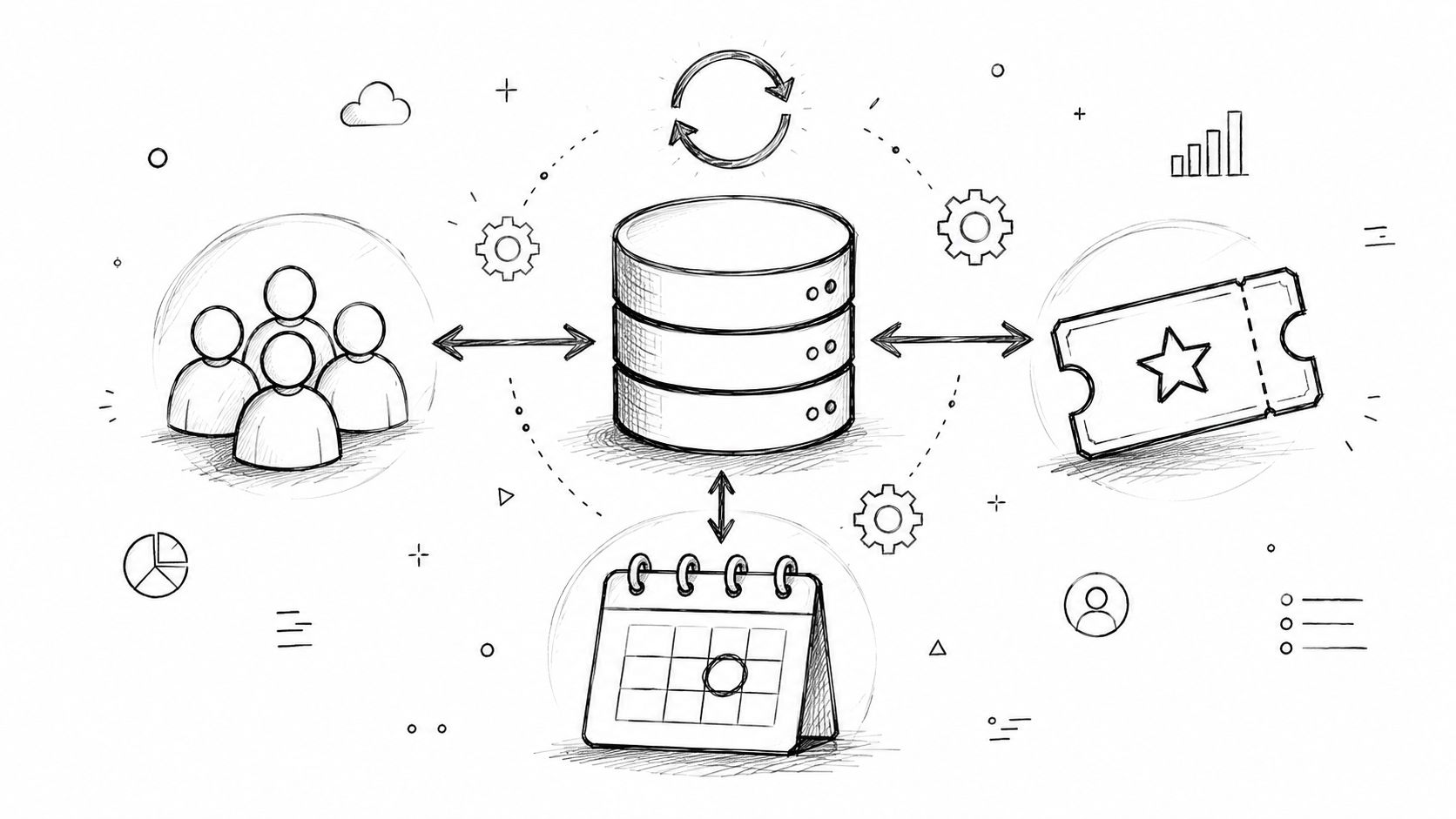
Let's make this tangible. Imagine you're using GroupOS to promote a new membership tier for your professional network. Your one and only conversion goal is getting people to sign up for a free 14-day trial.
Here’s how every element on that page would line up to support that goal:
Notice what isn't there? There are no links back to your main website, no distracting social media icons, and no feed of your latest blog posts. Each of those is an escape hatch, a potential exit ramp pulling visitors away from your one goal. By stripping away those distractions, you create an incredibly powerful, focused experience that maximizes your chance of conversion. This principle is at the very heart of what lead generation is and how to make it work for you. See how it works on your site when you implement this link: https://groupos.com/blog/what-is-lead-generation.
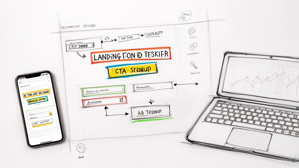
Alright, you’ve locked in your landing page's single focus. Now for the fun part: bringing it to life with words and design. This is where the magic happens, but you've got to be quick. You have about five seconds to grab a visitor’s attention before they click away.
Your headline and visual layout are the one-two punch that makes them stay. Forget clever taglines; compelling copy is all about creating an instant connection by answering the visitor's most pressing question: "What's in it for me?"
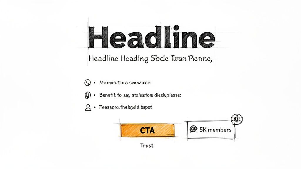
Let's be clear: your headline is the most important piece of copy on the entire page. Its only job is to be so interesting and relevant that the visitor has to read the next line.
A headline that actually converts is:
Your headline is a promise. The rest of your landing page copy is simply the proof that you can deliver. Keep it clear, direct, and laser-focused on what your user wants to achieve.
Visual hierarchy is the secret weapon of great landing page design. It’s the art of using size, color, contrast, and spacing to create a clear visual path for the user's eye, leading them right from your headline to your call-to-action (CTA). Without it, your page is just a confusing mess of elements all screaming for attention at once.
Think of yourself as a tour guide. Here’s how you lead the way:
So, how does this look in practice? Let's say you're building a landing page in GroupOS for your annual conference.
A winning structure might look something like this:
By arranging these pieces thoughtfully, you create an intuitive flow. The visitor’s eye is drawn from the big promise in the headline to the tangible benefits, and then settles naturally on the CTA. The decision to sign up feels easy and logical, not forced.
If you're looking to get even better at this, our guide on how to create engaging content has even more practical tips.
You’ve done the hard work. You've guided your visitor with compelling copy and a clear visual path, and now they're ready to take action. This is the moment of truth—the form. But this is also precisely where so many landing pages fall flat. A clunky, demanding, or confusing form is the undisputed champion of killing conversions.
Our goal here is to make this final step feel so effortless, so intuitive, that people barely notice they’re filling it out. Every field, every button, and every instruction needs to work in harmony to get them across the finish line without a second thought.
I want you to think of every single form field as a small hurdle. The more hurdles you put up, the fewer people will bother to jump over them. Your job is to ask for the absolute bare minimum you need to get the conversion.
For an event sign-up, do you really need their job title and company size right this second? Probably not. An email and a name are often all it takes to get them on the list. You can always circle back later with a follow-up email or a profile completion prompt to gather more intel.
Here are a few quick wins I’ve seen work wonders:
If you want to see these principles in action, we’ve put together a ton of examples in our guide to event registration form templates.
Handing over personal information, even just an email, requires a leap of faith. Your form’s design can either build that trust or trigger anxiety. Small visual cues and clear communication make all the difference in reassuring someone that their information is in good hands.
This is non-negotiable when you’re asking for payment for tickets or memberships. You have to build a bubble of trust right around the form to squash any last-minute hesitation.
Your form isn't just a data collection tool; it's the final handshake. Make it feel secure, respectful, and straightforward to leave a positive lasting impression.
For example, make sure you always include:
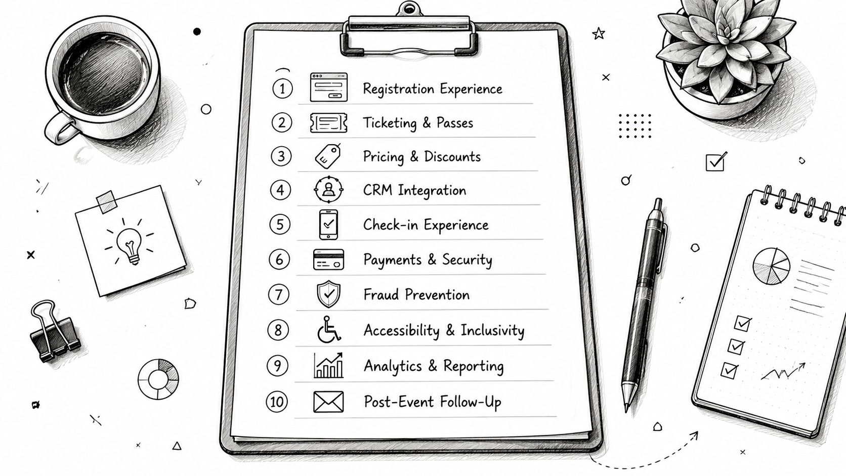
For events or paid memberships, especially when managed with a platform like GroupOS, the conversion point is often more complex than a simple sign-up. You might have to juggle different ticket tiers, group registrations, or optional add-ons. The secret is to break the process down into logical, bite-sized steps.
Don't dump every single option onto one overwhelming screen. Instead, guide them through a multi-step form.
This approach dramatically reduces cognitive load and makes the whole process feel less daunting. And the data backs this up. Top-performing pages, especially in the events and entertainment world, often see conversion rates of 11-12.9% or higher. A big reason for this is focus. Pages with a single, clear call-to-action convert at 13.5%, crushing the 10.5% rate for pages cluttered with five or more distracting links. You can dig deeper into these landing page statistics and their impact to see just how critical focus is.
By building a frictionless, trustworthy, and laser-focused conversion point, you remove that final barrier and turn curious visitors into committed members of your community.
In the landing page game, speed isn't just a nice-to-have; it's the bedrock of a good user experience. If your brilliantly designed page takes an eternity to load on a smartphone, you’ve already lost the conversion before anyone even reads your headline. Let's be clear: technical optimization isn't some final polish you add at the end—it's a core part of building pages that actually get results.
A one-second delay in page load time can absolutely tank your conversions. For a platform like GroupOS, where the goal is driving sign-ups for events or memberships, this kind of technical drag translates directly into lost revenue. Every single thing on your page, from that big hero image to the tiny tracking scripts, needs to be evaluated for its impact on performance.
Mobile traffic isn't just a big piece of the pie anymore; it is the pie. Your landing page isn't just being viewed on a phone; it's often a mobile-first experience. Your audience is on the move, dealing with spotty Wi-Fi or cellular data. Patience is in short supply, and a slow, clunky page is an instant turn-off.
For those of us promoting memberships and events, the stakes couldn't be higher. Just one extra second of load time can cut conversions by 7%. The real drop-off point? Two seconds. After that, people start bouncing. Given that mobile already converts at a rate 8% lower than desktop, a sluggish page can completely wreck your campaign's ROI. On the flip side, fast, snappy pages can boost mobile conversions by a whopping 25.2%. You can dig into more stats like these to see how they impact marketing leaders.
So, how do you get there? Focus on these practical, high-impact fixes:
The chart below really drives home how small design decisions can have a massive effect on your conversion rates.
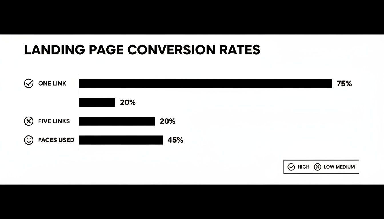
The data tells a clear story: focus is everything. A single, clear call-to-action crushes a page with multiple competing links. And using real human faces? That builds a connection and gets people to engage.
What makes a landing page truly great? When everyone can use it, no matter their abilities. Accessibility isn't just about ticking a compliance box; it's about inclusive design that opens your doors to a wider audience and ensures every single person has a good experience. The Web Content Accessibility Guidelines (WCAG) are your roadmap here.
Thinking about accessibility from the start isn’t an extra step; it’s a better way to design. An accessible page is almost always a more usable, clearer, and higher-converting page for all users.
The good news is that making your page accessible doesn't mean you have to start from scratch. A few small, intentional adjustments can make a world of difference.
Here are the key principles you need to nail:
To ground all this in reality, it helps to know what "good" looks like. The table below breaks down some critical performance metrics. Use these benchmarks to set realistic goals for your own pages and quickly spot areas that need attention.
These numbers aren't just vanity metrics; they directly connect to your bottom line. Prioritizing both speed and accessibility isn't just the right thing to do—it's how you build a landing page that's welcoming, technically sound, and incredibly effective for the widest possible audience.
Launching your landing page isn’t the finish line—it’s the starting block. Real growth happens when you stop guessing what works and start listening to what your users are actually doing. This is where analytics and A/B testing become your secret weapons, turning raw data into insights that systematically boost your conversions.
Think of it this way: your initial design is just a well-educated hypothesis. User behavior data is the experiment that proves or disproves it. When you dig into that data, you can move beyond simply counting sign-ups and start understanding the why behind your page’s performance.
While that final conversion number is the goal, it's what we call a lagging indicator. To really figure out how to make your next landing page even better, you need to look at the user behavior metrics that lead up to that conversion. These are the clues telling you where your page is winning and where it’s creating friction.
Tools like Google Analytics or Hotjar provide a goldmine of this information. Instead of getting lost in dozens of reports, just focus on a few key metrics that tell a compelling story about the user experience.
Here are the vital signs you should be watching:
By piecing these behaviors together, you get a much clearer picture of your user's journey and can pinpoint the exact elements that need a tune-up. You can learn more about how these qualitative data points feed into a bigger strategy in our guide on community engagement metrics.
Once your analytics have flagged a problem area, A/B testing is how you find the solution. The concept is simple: you create two versions of your page (an "A" version, the original, and a "B" version with a single change) and show them to different segments of your audience to see which one performs better.
The key to successful A/B testing is being methodical. Don’t just throw random changes at the wall to see what sticks. You need to start with a clear hypothesis based on the data you’ve gathered.
A great A/B test isn’t a random guess; it's a calculated experiment. It starts with a hypothesis like, "I believe changing the button text from 'Submit' to 'Get My Free Ticket' will increase urgency and lift conversions because 'Submit' sounds like a chore."
From there, you want to test the elements that have the biggest potential impact on your conversion rate first. It’s all about getting the biggest wins with the least amount of effort.
Not all tests are created equal, so you want to focus your energy where it truly matters. Here’s a simple hierarchy for what to test first on your event or membership landing page.
By following this data-driven loop—analyzing user behavior to form a hypothesis, running a disciplined A/B test, and implementing the winner—you shift from designing a static page to building a dynamic conversion engine. This process of continuous improvement is what separates the good landing pages from the great ones.
Even with the best game plan, you're going to run into questions as you start building. Here are some of the most common ones I get from marketers and community builders, along with my straight-to-the-point answers to keep you moving.
As few as humanly possible. Seriously. Start with the bare minimum you need for your goal, which is often just an email and maybe a first name.
Every extra field you add is another little hurdle for your visitor. Think of it as asking for someone's life story two minutes after you've met them. Your only job right now is to get the conversation started. You can always ask for more information later on, once they're already in your world.
A couple of quick wins:
Your headline. No question. It's the first thing people read, and it has an outsized impact on whether they stick around or hit the back button. I've seen a great headline double conversions with no other changes.
Try testing two completely different angles. For an event page, you might pit a benefit-driven headline like "Master Community Building in 3 Days" against a pain-point-focused one like "Struggling to Keep Members Engaged?"
Once you find a clear winner, then you can move on to testing the next biggest lever: your main call-to-action (CTA) button.
Testing isn't just about picking a winner. It's about learning what makes your audience tick. Every test gives you a piece of the puzzle you can use for all your future marketing.
For almost every campaign, the answer is a hard no. Your landing page has one job and one job only. A navigation menu is like putting a bunch of shiny exit signs right next to the one door you want people to walk through.
By stripping away the main nav and other links, you create a focused path directly to your CTA. Keep your visitors on the rails you've laid out for them. The only exceptions are the legally necessary links in the footer, like your privacy policy or terms of service. They build trust without creating a major distraction.
They might look alike, but they do very different jobs. Knowing which one to use is crucial.
A lead generation page is all about the form. Its entire purpose is to capture a visitor's information—usually their name and email. Every element on the page, from the hero shot to the testimonials, is there to convince someone to fill out that form and become a lead.
A click-through page has a much simpler task: get the click. It doesn't have a form. Instead, its job is to sell the visitor on the idea of taking the next step, which is often clicking through to a more complex checkout or registration page. It's a "warm-up" page designed to build desire before the final ask.
For a great deep-dive on this, the team at Dynares put together a fantastic guide on How to Create a Landing Page That Actually Converts.
Ready to build landing pages that don't just look good but actually fill your events and grow your membership? With GroupOS, you get intuitive drag-and-drop tools designed specifically for creators and communities. Start your free trial and see how easy it is to create high-converting pages at https://groupos.com.